My Whole Home Soothing PAINT COLORS!

Looking for whole home paint colors? Here’s an easy to use soothing palette from my own home!
Want to know the number one question I get asked? What is that paint color?
Why is that? I use very soothing colors in my home!
Plus the paint color palette I use all works in harmony together. With the craziness of the world, everyone is looking for a more peaceful home environment.
To help you as you plan your own home makeovers, I’m sharing all of the colors downstairs for a whole home paint color palette.
Because I worked for the paint company Valspar for 5 years the paint colors I originally used were from that brand. Sherwin Williams has since acquired them, so I am now listing the matching SW colors too.
Many of the Valspar colors were discontinues and the Sherwin Williams matches can be purchased at Lowe’s Home improvement stores.
The Need for Soothing Paint Colors
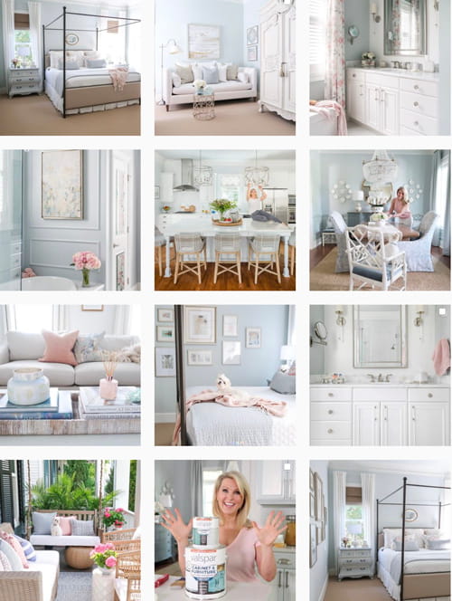
If you look at my Instagram feed, you’ll quickly see I LOVE shades of blue and white.
Since my home is open concept, it makes paint color selection a little trickier!
The colors I choose are always thoroughly evaluated over weeks, with painted 8 x 10 samples, testing them in light throughout the day.
Porch Daydreamer Instagram Feed
When standing at my kitchen island, you can see every room downstairs!
So I am careful to choose colors that work together in unity AND serenity.
That makes my home feel cohesive in color and oh so soothing!
whole home paint colors that work together
It’s the first thing people say when they enter my home…that it is calming 🙂 The best compliment ever.
Pin It for Later!

Contains hand selected products, with affiliate marketing links where I may make a small commission if a purchase is made. {full disclosure here}
Whole Home Paint Colors: Soothing Blues and Whites
Over the years, I’ve tackled some major makeovers around the house. Most of them were downstairs to refresh what had become outdated since I purchased the home in 2010.
The goal in each of these room makeovers was to lighten and brighten each space.
Best White and Neutral Paint Colors: Walls, Cabinets and Trim
I’ve lived in my home for over 10 years, which is typically when paint colors and finishes start to look dated.
Major home improvement updates:
- Remodeled the kitchen with new backsplash, cabinet and wall paint, barstools, and lighting.
- Updated the family room with new wall paint, lighting, furniture, and accessories.
- FULL remodel of the primary bathroom to get rid of the ugly beige tile.
These two spaces are OPEN CONCEPT and one very large room that sits in the center of the downstairs of my home.
PAINT COLOR was at the core of the room makeovers and is the most affordable update in any home.
Not only will I share the two updated spaces, but the other main rooms in the downstairs of my open concept home.
You will see how I’ve developed a whole home paint color palette in blues and whites.
Plus I added simple paint drops on the room photos, so you know where I used each paint color.
Whole Home Paint Color Room Tour
- Kitchen
- Family Room
- Dining Room
- Foyer
- Primary Bedroom
- Primary Bathroom
You Might Love: How-to Pick a Paint Color
Then if you want to dig into the details of any particular room, I’ve listed the blog post at the top where available.
LOTS of PINTEREST images to file and use later 🙂 Remember my friends…ALWAYS BUY A PAINT SAMPLE TO TEST IN YOUR OWN HOME.
Paint colors look different on your device and will change based on your lighting and accessories. Take my FREE class on choosing paint colors.
Kitchen Remodel in Blue and White
Remodeling the kitchen is not for the faint at heart, but it’s so worth it!
Yes, your life is disrupted a couple of weeks for minor changes and clean up isn’t fun.
It’s like having a baby, once you see how beautiful it is you forget how painful it was 🙂
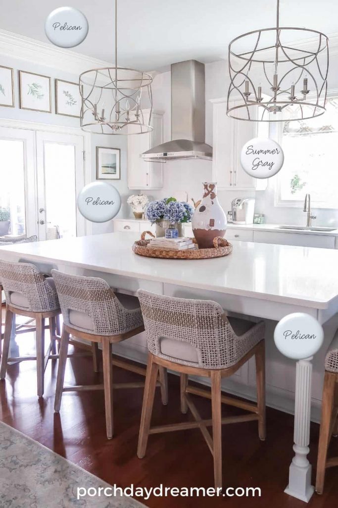
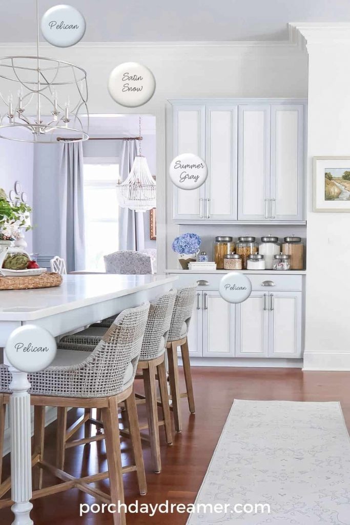
WALL COLOR: Valspar, Satin Snow 7004-17 or Sherwin Williams, Snowbound 7004
CEILING COLOR: Valspar, Pelican 4007-1A or Sherwin Williams, Misty 6323
CABINET White: Valspar, Summer Gray 7006-17 or Sherwin Williams, Snowbound 7004
KITCHEN ISLAND: Valspar, Pelican 4007-1A or or Sherwin Williams, Misty 6323
A little trick of mine is to paint the ceiling a color too!
This home came with the most gorgeous DEEP moulding at the ceilings and baseboards.
If you have a large open room, try painting the ceiling.
It draws your eye up, emphasizes great millwork, and visually ties two rooms together!
Shop Kitchen


The bar stools I keep trying to link and as fast as I do they sell out!
You’ll have to provide your email for the link, but they had them.
Family Room in Warm White
This was my other BIG makeover in 2020 and it took ALL year LOL.
With in person shopping shutdown, I took my time buying things online and sending them back.
This room isn’t totally finished yet, but the walls got a brand new color and I love it!
I tiled over my peach marble fireplace surround and you can too!
READ: How-To Tile Over a Marble Fireplace Surround
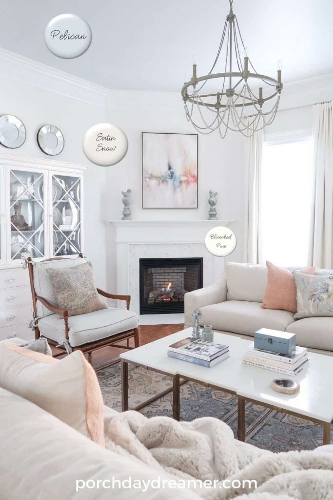
WALL COLOR: Valspar, Satin Snow 7004-17 or Sherwin Williams, Pearly White 7009
CEILING COLOR: Valspar, Pelican 4007-1A or Sherwin Williams, Misty 6323
If you are looking for a nice soft, but warm white then this is your color! It would be perfect as a whole home paint color too.
There are no yellow undertones and it goes with gray, oatmeal, and cream.
If you look back at the pantry area of the kitchen, it is the same wall color in a different setting.
A versatile color that can work in a wide variety of rooms and home styles.
I also custom mixed a color to paint the inside of the china cabinet as well, to shift it to a more current blue.
The ceiling got a new paint makeover too because it shares the ceiling with the kitchen and sitting area.
The next paint makeover was the fireplace mantel, see how it looks now!
Shop Family room


Dining Room in Shades of Blue
This room was the one that got a makeover first and set the basis for my WHOLE HOME PAINT COLORS!
First of all, I am OBSESSED with this paint color and it is the one I consistently get asked about through social media.
It’s also one that not one but TWO of my friends used in their own homes 🙂
This room is more contained, so I could use color and decided to paint the wainscoting as well, for a monochromatic look.
How-to Chalk Paint Stained Furniture (credenza is painted)
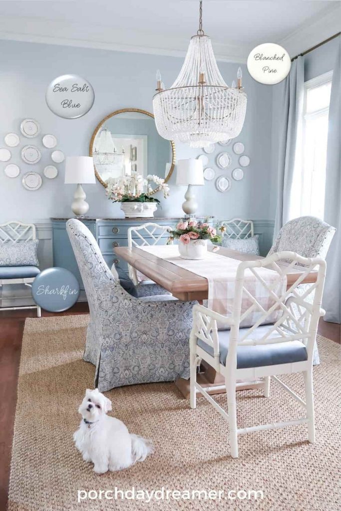
WALL COLOR: Valspar, Sea Salt Blue CI 191 / Eggshell or Sherwin Williams, Tradewind 6218
WAINSCOTTING COLOR: Valspar, Sea Salt Blue CI 191 / Semi-Gloss or Sherwin Williams, Tradewind 6218
CREDENZA COLOR: Valspar, Sharkfin 4007-2A or Sherwin Williams, Cadet 9143
Did you know a higher paint sheen deepens the same color?
Yes, and you can download my paint sheen guide at the bottom of this post.
I got REALLY lucky and found drapes that matched the paint color to keep things soft and consistent in color.
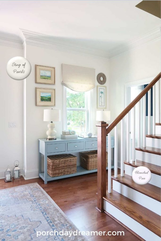
Foyer in Soft White
The foyer sits adjacent to the dining room, so I decided a neutral soft white was the best option.
This white does have more color to it and is creamier than the family room white.
It is the perfect backdrop as you enter my home because it compliments and doesn’t compete with the other colors downstairs.
How-to Paint Stair Risers White
I have a review on the rug, if you are interested: Pottery Barn Finn Rug Review
WALL COLOR: Valspar, String of Pearls CI198 or Sherwin Williams, Creamy
FOYER TABLE COLOR: Valspar, Blue Twilight 5001-1C or Sherwin Williams, Debonair 9139
STAIR RISERS: Valspar, Blanched Pine 7005-15 or Sherwin Williams, Pure White 7005
This room also faces north like the dining room, so a lighter shade is the better option.
Plus it lets the rug and console shine in the space!
Master Bedroom in Calming Blue
When making over the master bedroom, at the core was a canopy bed!
The room was previously in a pale blue, but it was getting dated with a more yellow undertone.
So the next priority was finding a calming blue and I found the PERFECT color.
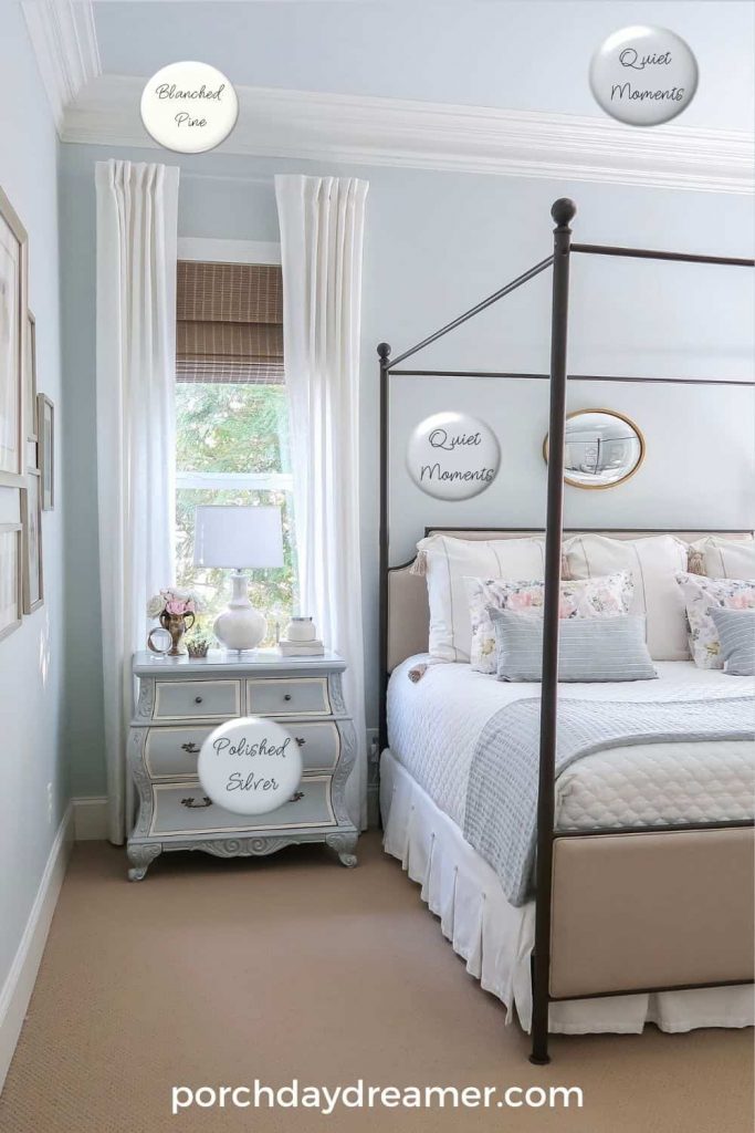
WALL and CEILING COLOR: Benjamin Moore, Quiet Moments, 1563, tint strength 50%
TRIM COLOR: Valspar, Blanched Pine 7005-15 or Sherwin Williams, Pure White 7005
FURNITURE COLOR: Valspar, Polished Silver 4008-1B or Sherwin Williams, Samovar Silver 6133
This soft blue has a hint of gray so it creates a great backdrop for the bronze bed.
Plus nicely highlights the framed artwork in gold on the gallery wall.
It even works with other shades of blue and the newly painted blue nightstands.
Shop Bedroom


Primary Bathroom in Blue Gray
The primary bathroom was a MAJOR remodel and you may want to see the before, with all of the beige tile!
It’s hard to believe it’s the same room, but wow it came out beautifully.
I looked for a blue that worked specifically with the marble counter and tub deck…that was my guide.
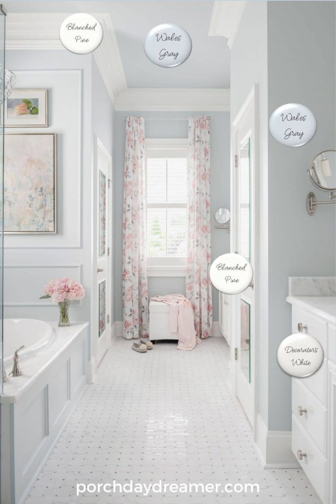
WALL and CEILING COLOR: Benjamin Moore, Wales Gray 1585, Tint Strength 50%
CABINET COLOR: Benjamin Moore, Decorator’s White OC 149
TRIM COLOR: Valspar, Blanched Pine 7005-15 or Sherwin Williams, Pure White 7005
So you know, if you you look at this color online it looks like it has some green.
Even when I painted the sample it looked a little green, but on the wall it is all blue gray!
It’s such a soft color I took it to the ceiling to help emphasize all of the deep crown moulding and draw your eye UP.
shop bathroom


Hopefully, you LOVE this home tour and found some ideas for your own home.
Or if you are building a home and just need a pretty white, you found a nice option.
The trim color I list is a GREAT all around white for the moulding in your home.
WANT MORE HOME TOURS? CLICK HERE!
Sign-Up for my Weekly Emails!
Straight to your inbox sharing can’t miss decorating and painting tips for your home.
Please consider following me on Pinterest and Instagram for daily inspiration.
Until next time…
PORCH DAYDREAMER
Tracey
Tracey,
I fell in love with some of your paint choices and tried to find them on the Lowe’s website. I looked specifically for Satin Snow 7004-17 and Blanched Pine 7005-15 and they had neither. They had Satin Snow Cap, but the numbers were not the same. How old are these paint color choices?
I am sooo bummed since I have been hunting for the perfect whole house white for months now and found it in the Satin Snow.
Please help!
Blessings,
Teresa
Hi, Teresa! The Lowe’s website isn’t the best place to find the color. I have the paint colors linked in the post and they go straight to the Valspar site. They are current and you can take the name and color number with you to the Lowe’s store. They can type it into the computer at the paint desk and tint. Or you can find the paint chip in the color rack. I just did this with a Sherwin Williams color.
Love the serenity your home exudes. Many ideas for my home update. I was wondering, I had my kitchen cabinets resurfaced and would like to know if there is a good paint for the insides of the old wood cabinets, that wouldn’t smell with the doors closed. Keep the updates and projects coming, I just love your style.
Thank you! Yes, the paint I used on my own cabinets is low VOC and doesn’t smell after it dries. You can learn about it here: https://porchdaydreamer.com/valspar-cabinet-furniture-enamel-review/
I absolutely love your color updates- so clean and fresh! Thankyou very much
Thank you! I’m happy it helps 🙂
it’s very obvious that you have put alot of thought into your paint colors!
they are gorgeous
Thank you! Paint color is definitely a passion of mine.
Hi , Your home is lovely thank you for sharing. I was hoping you might be able to tell me where you got your kitchen counter stools, they are something I have been looking for. Thank you.
Dianna
Thank you! I’ve linked a new section with all of the known locations to buy them and added a similar stool too.