Finding Paint Colors to Match Your Home Decor: Expert Tips

Sharing my expert tips on matching paint colors to your existing home decor. Learn how to create a balanced palette, use neutrals to your advantage, and consider lighting plus undertones for a cohesive space.
Finding paint colors to match your home decor can seem like a daunting task, but it doesn’t have to be!
I can teach you what I’ve learned from building and decorating multiple houses, being that go-to friend for decorating advice, and working as a professional paint color expert.
Through all of that I’ve learned how to create cohesive and visually appealing spaces using paint colors.
Whether you’re a seasoned decorator or just starting out, these expert tips will help you achieve the perfect balance between your paint colors and home decor.
Start with a Color Story
Before picking a paint color, it’s essential to have a color palette or what I like to say is a “color story” in mind.
This color story or palette should include a mix of primary, secondary, and accent colors that complement each other. OK, I know this sounds complicated but I’ll help make it simple for you.

- Slate Blue – Sherwin Williams, Aleutian
- White – Benjamin Moore, Decorator’s White
- Pale Pink – Sherwin Williams, Rosebud
- Beige – Sherwin Williams, Modern Gray
The best way to create a color story is to use your existing home decor as the foundation. I like to call this the “one thing” method.
For instance, here is bedding that has gorgeous colors from white, to blue, to beige and blush. So many paint colors can be pulled from this one piece of fabric.
Every beautiful room created by an interior designer likely started this way. The “one thing method” means you’re going to look at all of the important home decor elements in the room to identify the best paint colors.
Ultimately, you need to hone in on one key piece of home decor to help you define the primary color for the walls.
Contains hand selected products, with affiliate marketing links where I may earn a small commission if a purchase is made. {full disclosure here}
Assess Your Existing Decor
Begin by taking a good look at the major elements in the room: furniture, rugs, curtains, and other significant decor items like wallpaper.
Identify the dominant colors in these pieces, as they will serve as the basis for your color palette.
For instance, if you have a green sofa, you might want to consider shades of blue or colors that harmonize well with green.
Or maybe your rug has a shade in it you love that would be a beautiful paint color?


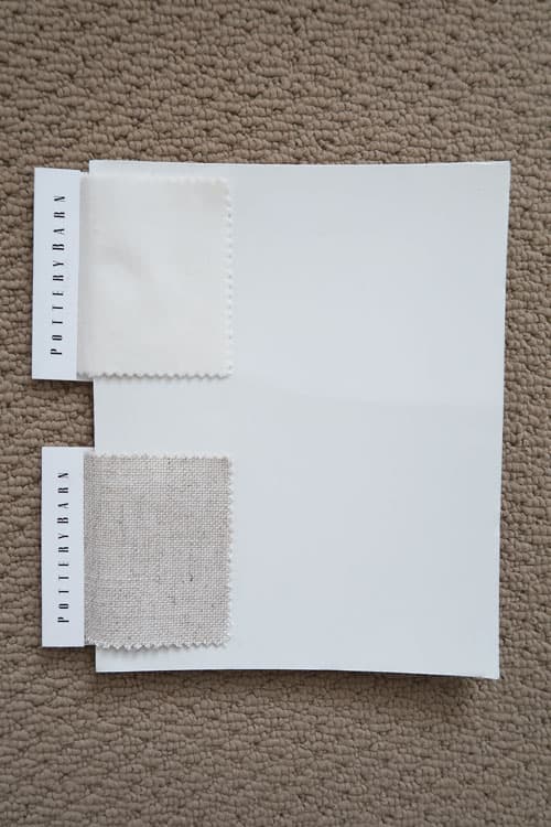
I found the paint color for my furniture within my rug and the wall color from my Pottery Barn Sofa and Drapes:
Identify Dominant Colors and Patterns
Look for recurring colors and patterns in your decor. If your furniture has a bold pattern, pick out the main colors within that pattern.
These will guide your choice of wall paint and other finishes. For example, a beautiful pillow in green and cream could inspire a palette that includes soft blue walls, green accents, with deep shades of charcoal.

Consider Other Finishes in the Room
In addition to your decor, take into account the finishes in the room, such as flooring, cabinetry, countertops, and even hardware like doorknobs and light fixtures.
These elements should work seamlessly with your chosen color palette.
- Flooring and Tiles: If you have dark wood floors, consider lighter wall colors to create contrast and avoid making the room feel too dark. They have a gray undertone, so find a paint color in a complementary tone.
- Cabinetry and Countertops: Kitchen and bathroom cabinets, as well as countertops, have a significant visual impact. If your countertops have a distinct color or pattern, ensure your paint choice complements rather than clashes with these surfaces.
- Hardware and Fixtures: Pay attention to the finishes of your hardware and fixtures, such as brass, chrome, or matte black. These details can subtly influence your color choices.
- For instance, warm metal finishes like brass work beautifully with warm paint colors, while cooler metals like chrome complement cooler tones.
Understanding Undertones
When selecting paint colors, it’s crucial to pay attention to the undertones. Undertones are the subtle hues that lie beneath the main color.
A seemingly neutral beige or white can have pink, yellow, or green undertones, which can clash with your decor if not carefully considered.
Stop Picking the Wrong Paint Color Undertones

- Warm Undertones: Colors with warm undertones include reds, oranges, and yellows. They create a cozy, inviting atmosphere and pair well with warm wood tones and brass or gold finishes.
- Cool Undertones: Colors with cool undertones include blues, greens, and purples. They create a calm, serene environment and work well with cooler metals like chrome or nickel, as well as grey or black finishes.
- Neutral Undertones: Some colors have neutral undertones, making them versatile and adaptable to various decor styles. These include shades of white, grey, and beige that neither lean too warm nor too cool.
Consider the Lighting in the Room
Lighting plays a crucial role in how paint colors appear in a space. Natural light changes throughout the day and can significantly impact the perception of color.
- North-Facing Rooms: These rooms tend to receive cooler, softer light. Paint colors may appear darker and cooler, so it’s often best to choose lighter, warmer hues to balance the natural light.
- South-Facing Rooms: These rooms get the most natural light, making colors appear brighter and warmer. Almost any color will work well, but be mindful that strong colors can become more intense.
- East-Facing Rooms: These rooms get warm, bright light in the morning and cooler light in the afternoon. Warm colors can help maintain a cozy feel throughout the day.
- West-Facing Rooms: These rooms receive cooler light in the morning and warm, golden light in the afternoon and evening. Cooler colors can balance the intensity of the afternoon light.
Create a Balanced Palette with the 60-30-10 Rule
Once you’ve identified the key colors from your decor and finishes, create a balanced palette using the 60-30-10 rule. This interior design principle helps you combine colors in a way that is visually appealing and harmonious:
- 60% Dominant Color: This will be your primary color, often used for the walls. It’s the base color that sets the tone for the room.
- 30% Secondary Color: This is a complementary color used for larger accents like furniture, rugs, and curtains. It supports the dominant color while adding depth and interest.
- 10% Accent Color: This is a bold or contrasting color used sparingly for smaller accents like pillows, artwork, and decorative items. It adds a pop of color and personality to the space.

In this VERY colorful and well designed room, they expertly used the 60-30-10 rule to balance the mix of colors.
This room’s color story was developed by identifying all of the colors in the pillow fabric (buy pillow).
- The dominate color is a cobalt blue found on the walls, in the artwork, pillows, rug, and accessories.
- Hot Pink is the secondary color found in the artwork, rug, and accessories.
- An emerald green couch is used as the perfect accent color to tie the color palette together.
By blending cobalt blue, hot pink and emerald green the room feels cohesive and energetic.
The pillow fabric is what anchors all of the colors together. Do you see how by starting with “one thing” can be used to your advantage to build a color story?
The cobalt blue wall could just as easily been painted a bright blue instead.
Use Neutrals to Your Advantage
Neutrals are versatile and timeless, making them an excellent choice for any room. They provide a perfect backdrop for bolder colors and patterns in your decor.
Consider using shades of white, gray, or beige for your walls and adding pops of color through your furnishings and accessories.
Neutrals can help balance the intensity of bold decor elements and create a sophisticated, cohesive look.

Balance Bold Colors with Neutrals
If you love bold colors but are worried about overwhelming your space, balance them with neutral shades.
For instance, if you have a bright cobalt blue sofa, painting the walls a soft, neutral color like a cool crisp white will help tone down the intensity and create a cohesive look (my favorite white paint colors).
This balance ensures that the bold colors stand out without dominating the room.
Take Inspiration from Nature
Nature is a fantastic source of color inspiration. Think about the colors you see in your favorite outdoor spaces—beaches, forests, or mountains. These natural color combinations are often soothing and harmonious.

For instance, the soft blues and greens of a beach setting or the rich, earthy tones of a forest can inspire a tranquil and cohesive color scheme for your home. Check out my coastal paint color picks.
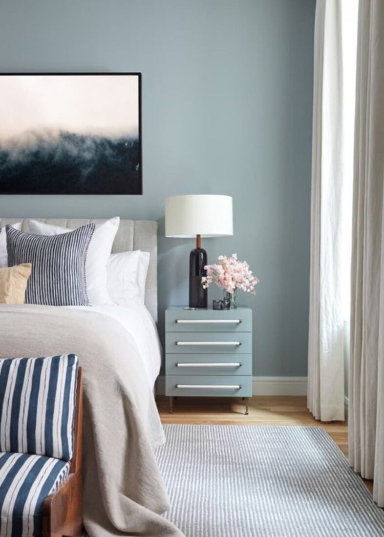
Try to incorporate similar hues into your home decor to create a relaxing and inviting environment. Mick my Maltese is LOVING the calm blue in the bedroom 🙂
Create a Flow Between Rooms
To create a cohesive look throughout your home, ensure there’s a flow between rooms.
This doesn’t mean every room has to be the same color, but they should complement each other.
My home has an OPEN CONCEPT floor both upstairs and downstairs. It was critical to choose paint colors that were complementary to each other.


Porch Daydreamer’s Paint Colors
Buy a color accurate peel and stick sample below:
- Sherwin Williams, Pure White
- Sherwin Williams, Snowbound
- Benjamin Moore, Decorator’s White
- Sherwin Williams, Pearly White
- Sherwin Williams, Creamy
- Sherwin Williams, Wool Skein
- Sherwin Williams Silverpointe
- Sherwin Williams, Mineral Deposit
- Sherwin Williams, Misty
- Sherwin Williams, Tradewind
- Benjamin Moore, Wales Gray
- Benjamin Moore, Quiet Moments
Consider using a consistent color palette or repeating certain colors in different rooms to tie everything together. I was able to use a deep bold blue in the power room because it sat alone.
However, I made sure the undertone worked with the room right outside of the powder room.
For example, if you use a soft blue in the living room, you might carry that color into the hallway or use a complementary color in the adjacent dining room.
This approach creates a sense of continuity and harmony throughout your home.
Test ALL Paint Colors Before You Commit
Finally, always test a few paint samples on your walls before making a final decision. Observe how the colors look at different times of the day and under various lighting conditions—natural light, artificial light, and even candlelight.
This will ensure that the colors not only match your decor but also look great in your specific space. Pick Paint Colors Better: Free Quick Class
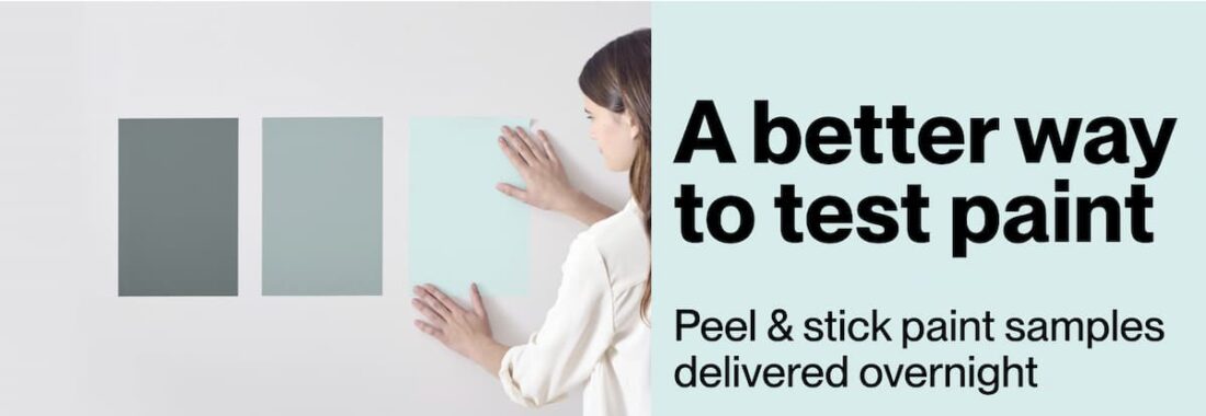
The EASIEST way to test a color is to apply color accurate peel and stick paint color samples.
Testing samples helps you see how the paint interacts with the room’s lighting, decor, and finishes, ensuring you make the right choice before committing fully.
Trust Your Instincts
While it’s essential to follow design principles and take inspiration from various sources, it’s equally important to trust your instincts. Your home should reflect your personality and style.
Don’t be afraid to bend the rules and choose colors that make you happy.
After all, you’re the one who will be living in and enjoying the space.
Final Tips for Perfect Paint Color Matching
To sum up, here are a few final tips to help you perfectly match paint colors with your home decor:
Use Online Paint Color Tools
Many paint manufacturers offer online tools that allow you to visualize paint colors in different rooms.
These tools can be incredibly helpful in giving you a preview of how different colors will look in your space.
Find Out Paint Colors Fast: Color Match Apps
Stay Updated on Paint Color Trends
While you want your home to reflect your personal style, it’s also beneficial to stay updated on current color trends.
Incorporating new and on trend colors can keep your home looking fresh and modern.
Or lean into timeless, but on trend paint colors for the perfect balance.
Consider the Room’s Function
When selecting paint colors, think about the function of each room and how you want it to feel.
For example, calming colors are great for bedrooms, while vibrant colors can energize a home office or kitchen.
Use Fabrics to Guide Paint Color Choices
The EASIEST way to find paint colors is to pull them from fabrics in the room, including upholstery, curtains, and bedding.
Here’s my family room I showed you earlier with the same rug, sofa, and wall color. I updated the space by painting the furniture, recovering the chair, and changing out the accessories.
The sofas drove my wall color decision! I wanted a neutral base so I could easily redecorate.

Use Neutrals to Your Advantage
Choosing shades of white or neutral paint colors is always a safe bet! The home decor can be the color, while the walls blend into the background.
Look for on trend neutrals, so your space feels fresh and new.
Consult with a Professional
If you’re still unsure about your choices, consider consulting with a professional interior designer.
They can provide expert advice tailored to your specific needs and preferences.
Feel Confident Finding Paint Colors to Match Home Decor
By starting with a well-thought-out color palette based on your home decor and finishes, considering undertones, factoring in the lighting in the room, and using the 60-30-10 rule to balance your colors, you can create a cohesive and visually appealing room that reflects your personal style.
Don’t forget to use neutrals to your advantage, balance bold colors, take inspiration from nature, and ensure a flow between rooms. Always test before you commit and trust your instincts.
Decorating is a personal and creative process—have fun with it and let your unique style shine through!
Whether you’re redecorating a single room or your entire home, these expert tips will help you confidently match paint colors with your home decor, creating a space that is beautiful, harmonious, and uniquely yours.
Sign-Up for my Weekly Emails!
Straight to your inbox sharing can’t miss decorating and painting tips for your home.