Stop Picking the Wrong Paint Color Undertones
Have you ever picked a paint color, loved it on the little swatch, and when the room is painted then HATE it? You probably picked the wrong paint color undertones.
Yes, I feel you and have made this mistake in my early paint picking days. Unfortunately, it was when I decided to pay a painter and not DIY the paint job.
Once you make the costly mistake of choosing the wrong paint color undertones, you NEVER want to make that mistake again!
Fortunately, I worked for one of the worlds largest paint manufacturers. During that time I educated myself about color.
I now know how to avoid picking a gray paint color with a purple undertones or a neutral paint color with orange or yellow undertones.
Let me help you avoid this paint color picking mistake once and for all! You are in good hands 🙂
Contains hand selected products, with affiliate marketing links where I may earn a small commission if a purchase is made. {full disclosure here}
How Paint Color Formulas are Created
Working for a paint manufacturer and selling to one of the largest home improvement headquarters, I learned ALL about tinting paint. We sold the colorant and supplied the tint machines too!
You’d be surprised how few colors make up the 10,000’s of colors available.
I am simplifying this for you, but here are the general colorants that makeup all paint colors. Those colorants are tinted into a base of paint.

Colorants That Create All Paint Colors
- White and Black
- Yellow and Yellow Oxide
- Phthalo Blue
- Phathalo Green
- Red and Red Oxide
- Magenta
- Raw Umber
They are combined in different strengths to create a single color, inside of a base paint.
The lighter the color like white the thicker/whiter the base paint is prior to tinting.
For darker colors, more colorant added to the base paint so it’s typically thinner and more clear.
When you are trying to determine undertone, you are really trying to figure out which one of these colors or colorants is dominating the primary color.
What are Color Undertones?
My hope is that by giving you an everyday example it will help you understand undertones in general.
Maybe you’ll be more familiar with skin tone or skin undertone to start. When choosing a makeup color, you should pay attention to your own skin tone.
You need to determine if your skin undertone is warm, cool, or neutral. Blue veins = cool, green veins = warm and a combo makes you neutral.
For instance, my skin has cool to neutral undertones. When I use warmer shades of foundation, lipstick or blush it looks terrible!
The same thing happens with paint colors my friend! That’s usually why you don’t like the color once it’s up on the wall.
It’s the undertones that feel off with the rest of the room or objects in the room.
Paint Color Undertones Defined
Now let’s talk about undertones in paint colors. Paint color undertones are the secondary colors that are hidden within a paint color. They can completely change the way it looks.
Almost every paint color has undertones except for pure white, black, or primary hues (red, blue, yellow).
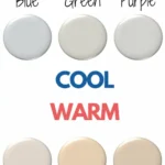
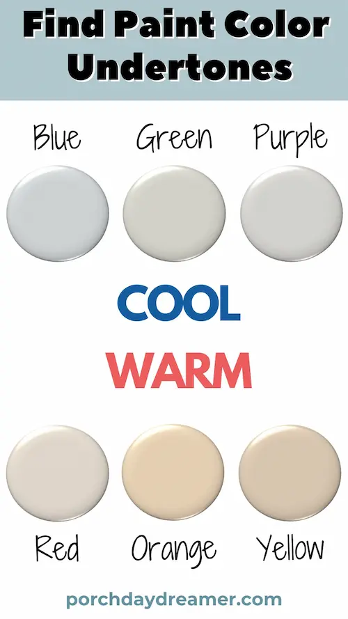
two primary categories: warm or cool
- A warm undertone is typically red, orange, yellow, or gold.
- A cool undertone is typically blue, green or purple.
What is a gray undertone?
- When you see a gray undertone it’s due to black colorant in the paint color formula.
- That typically makes the color have a more of a neutral undertone.
Hopefully, now you have a baseline to understand the larger groups of warm undertones, cool undertones and neutral undertones in paint colors.
But Tracey, HOW do I figure out what undertones are in the paint colors I am choosing? Let’s dive into that next!
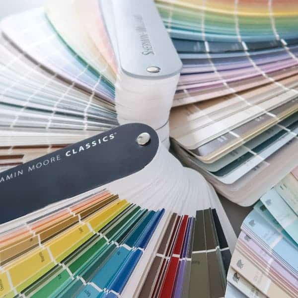
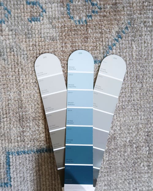
I STRONGLY advise buying color fan decks because it makes it MUCH easier to see the different undertones.
Buy them here:
- Sherwin Williams Paint Color Fan Deck
- Benjamin Moore Fan Decks: Collections and Classic
Easy Ways to Find Undertones
Let’s go the cheap and easy route shall we? I know you want a quick answer, so here are 5 options to assess the undertones in a paint color.
If you are brand new to finding color undertones, my advice is start with two paint colors in the same hue like blue or white (primary color).
Before you even start, put the colors against each other. Note the differences you see. Are there warm or cool undertones popping up?
| Undertone Type | Typical Colors |
|---|---|
| Warm | Red, Orange, Yellow, Gold |
| Cool | Blue, Green, Purple |
| Neutral | Gray |
Keep on hand in your phone’s note app colors associated with warm undertones and cooler undertones to help you remember.
5 Tricks to find Paint color Undertones
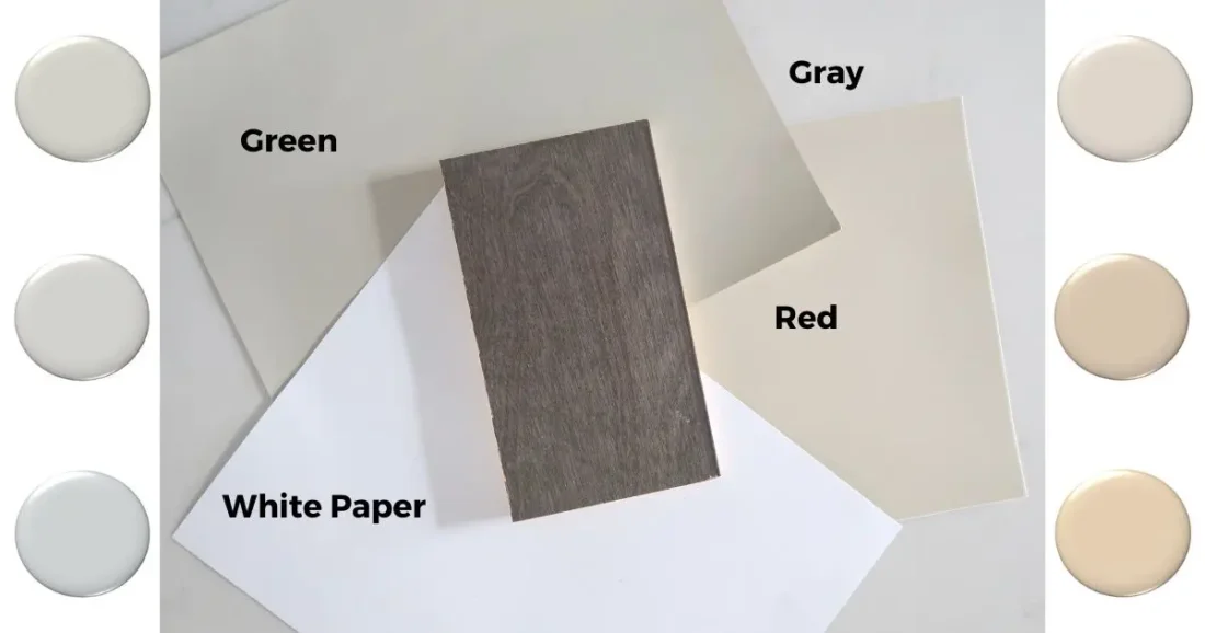
- White Printer Paper: This is a go-to for interior designers. Grab a white piece of paper and place your paint sample on top of it in bright natural light. See what undertone dominates.
- Darkest Value Trick: If you see color really well, you can also look at the darkest shade on the paint strip. That is the most pigmented version of the same color, so the undertone will be more prominent.
- Side-by-Side Method: Conduct a side-by-side comparison of two similar colors, such as two shades of blue, to determine the undertones each possesses.
- Comparison Analysis: Place the color up against flooring, a counter, or stained cabinets to see undertones in comparison to the paint color. See if the undertones are the same or different.
- True Color Test: Evaluate differences within the same color family. For instance, when assessing a red, placing against a primary red to identify any underlying yellow or violet undertones.
But Tracey, what is the BEST method to use out of these options?
My advice is start by combining the “side by side” and “white printer paper” methods.
Then compare to important pieces in the room that have to stay: flooring, counters, couch fabric, etc.
ALWAYS do this in natural filtered sunlight not artificial light.
Do you see another color coming through? Like a blue undertone or yellow undertone?
Yellow undertones are best avoided in my personal opinion. They are hard to live with!
That will help train your eye to start seeing differences in paint colors at a deeper level.
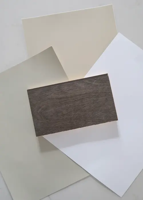
When I look at the paint colors against my counter and flooring with the white printer paper, clear undertones appear.
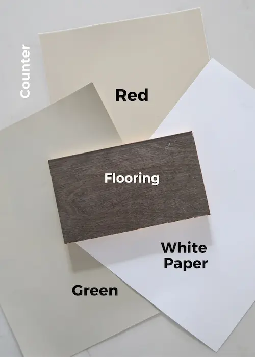
The flooring has a variety of undertones both green and red, so it’s versatile. Warm, cool and neutrals go with it.
Gray dominates the counter pointing toward cooler colors for a more cohesive look.
Comparison analysis is ALWAYS best to find the undertones. Two colors may work perfectly for the room.
It then becomes a decision point: warm, cool or neutral undertones work best with my room design or vision for the space.
Choosing Neutral and White Paint Color Undertones
If you specifically need help with white paint colors, you can read all about mixing white walls with white trim or my favorite white and neutral paint colors.
To help you further, here is a guide to the undertones in neutral white paint colors.
Common Undertones in Neutral Whites
| Paint Color | Undertones |
|---|---|
| Bright White | Blue, Gray |
| Off-White | Red, Gold, Green |
| Ivory | Yellow, Gold |
| Cream | Yellow, Red, Gold |
| Pure White | No Strong Undertones |
Specific to choosing a white, it’s best to put the color up against a white sheet of printer paper.
That’s the best test to find the undertones of a white quickly and easily.
Another thing to consider is that there are “tints” of colors that look white, but are really just the lightest or most pastel shade of a color.
Tints are paler and softer versions of the original color. So you may even see pure pink, blue, green, peach, etc when you compare it to white paper.
Unless you are looking for a color and not a neutral like in the chart above, steer clear of “tints”.
When in Doubt About the Undertone of a Paint Color
There is ANOTHER great trick I use as a back-up when I can’t decide.
Check the paint manufacturer’s website to see how they classify the color.
Most major brands offer this guidance, so you can narrow down the larger undertone categories:
- Warm undertone
- Cool undertone
- Neutral undertone (like gray)
In addition to saying the paint color has warm undertones or a cool undertone, they will often times specify if there is a dominant color like a green undertone, yellow, orange or purple.
Sometimes it’s as specific as violet if there is more red than blue. All of these nuances will help guide you to the right color.
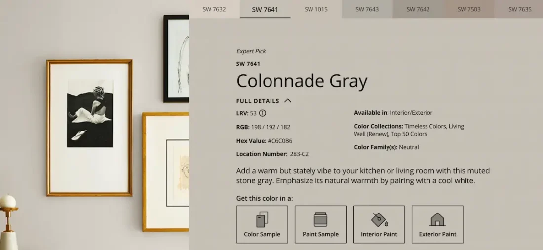
What I SPECIFICALLY look at are the RGB (Red, Green, Blue) values. The higher the number the more of that color is found in that paint color.
If you don’t want a gray with a lot of purple, stay away from high red and blue values. Those two primary colors create purple.
Another effective strategy, especially for light neutrals and whites, is to examine the mid-to-darker shades on a paint strip.
It may be easier for you to identify the undertone compared to the lighter shades at the top.
When in doubt about the undertone use the color temperature as your guide.
Simply determine whether the color feels warm or cool to you and consider what feeling you want to create in your space.
Warm colors typically radiate a cozy or energetic atmosphere, while cool colors evoke a fresh and soothing feel.
That’s why I LOVE using cooler colors with gray undertones in my home. You can see all the blue paint colors I use on this home tour.
My Process for Identifying Undertones
Alright, I’m a professional paint picker and analyzer. So I STUDY colors as a job and even predict paint color trends plus pick the best palettes each year.
In addition to this, I was given the gift of seeing color to a greater degree than the majority of people.
That’s why I LOVE to teach people because choosing colors is easy for me! Call me “color confident”.
Here is my 5 step process:
- I start with an important element (s) in the room: counter, flooring, rug, artwork, fabric, etc. for color to work with or match.
- To help eliminate certain colors, I decide first warm undertones or cool undertones are best in the space.
- Using a fan deck of colors, I hone in on a couple of colors that could work.
- I lay those colors next to each to see if they feel warm or cool or neutral.
- Then determine the dominate color undertone by laying next to items in the room.
- Typically I avoid heavy orange or yellow undertones.
- My preference is toward gray, blue and green undertones.
- For warmth, I look for undertones of red.
- For neutrals, I look for gray undertones.
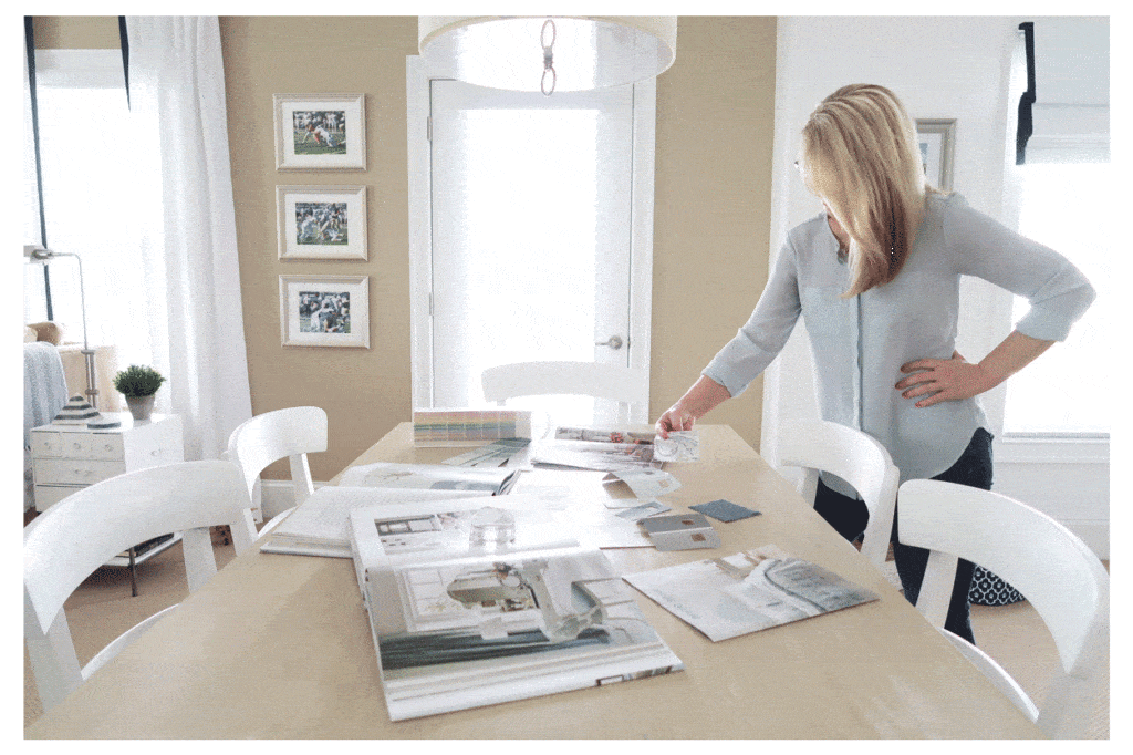
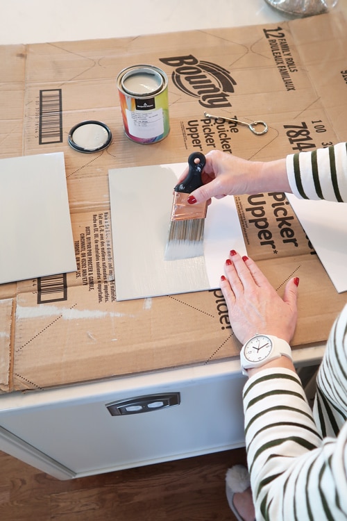
Then I pick the BEST color for the room design! I ALWAYS sample the colors too on 8 x 10 foam core boards or buy peel and stick samples.

Maybe seeing my process and getting into the way I analyze color will help you!
You now know more than MOST PEOPLE on how to identify and find undertones.
Need more help choosing paint colors? Download my free guide!