Pottery Barn Paint Colors: The Exact Shades They Use (with pictures)


Discover every Pottery Barn® paint color you’ve ever wanted to know! All the colors they use in their rooms, with pictures, organized by color family.
Have you ever wanted your home to look like the Pottery Barn catalog? I have! Lucky for you, I’m a paint color expert and also happen to love all things Pottery Barn.
I’ve done the research and found ALL 38 Benjamin Moore® paint colors they use throughout the catalog.
Now you can bring that designer-level look into your own home, without having to guess what paint color to put on your walls.

I’ll walk you through all of the Pottery Barn paint colors, complete with real room inspiration. You’ll see exactly how each one looks in a real room setting.
Whether you’re into creamy whites, rich greens, or dramatic navy, there’s a perfect paint color in this lineup. The hard part? Which paint color to love most!
Contains hand selected products, with affiliate marketing links where I may earn a small commission if a purchase is made. {full disclosure here}
Pottery Barn White and Neutral Paint Colors
Let’s be honest there’s no such thing as a “basic” white or beige when it comes to paint. Pottery Barn’s curated selection of whites and neutrals is all about soft warmth, subtle undertones, and classic versatility.
These timeless hues are anything but boring and are the perfect backdrop for natural textures like linen, rattan, and wood.
Whether you’re layering tone-on-tone whites or grounding your space with greige, these are the wall colors designers reach for again and again.

Chantilly Lace (OC-65)
A clean, bright white with virtually no undertone – perfect for modern spaces.
- Use in: Ceilings, trim, cabinets
- Pair with: Any color! It’s the ultimate neutral white

SHOP THE BEDROOM


Cloud Cover (OC-25)
A cool off-white with gray undertones, perfect for rooms with bright light.
- Use in: Bedrooms, bathrooms, or hallways
- Pair with: Marble, silver, and blue-based accents
- Seen in: Pottery Barn Blue and White Bedroom

Simply White (OC-117)
A warm white that still feels fresh and light, with just a hint of yellow undertone.
- Use in: Kitchens, living rooms, or full-house palettes
- Pair with: Soft blues, pale taupes, warm brass finishes

SHOP THE LIVING ROOM

Dove Wing (OC-18)
A warm, light greige-white with just enough depth to avoid feeling stark.
- Use in: Open-concept rooms, trim, and cabinets
- Pair with: Wood tones, iron accents, and ivory textiles
- Seen In: Pottery Barn’s vaulted ceiling living room with black and terracotta accents

Cloud White (OC-130)
A cozy, classic off-white with creamy undertones.
- Use in: Bedrooms or traditional spaces
- Pair with: Muted greens and dark hardwood floors

Navajo White (OC-95)
A traditional warm cream that leans buttery.
- Use in: Vintage-inspired spaces or historic homes
- Pair with: Brass, floral prints, and dark wood furniture

SHOP THE DINING ROOM

Dune White (CC-77)
A sophisticated off-white with soft gray-beige undertones.
- Use in: Dining rooms or layered neutral spaces
- Pair with: Linen slipcovered furniture and brushed nickel lighting
- Seen in: Pottery Barn’s neutral dining room in Sandwash finishes.

Wind’s Breath (OC-24)
A soft neutral with a warm undertone that shifts with lighting.
- Use in: Bedrooms or living rooms where you want gentle color
- Pair with: Beige upholstery, boucle, and travertine

Balboa Mist (OC-27)
A popular greige off-white that looks effortless and modern.
- Use in: Entryways, bedrooms, or entire homes
- Pair with: Soft taupes, grays, and muted blush or sage
Pottery Barn Blue and Green Paint Colors
There’s a reason blues and greens are some of the most-loved paint colors. They bring calm, sophistication, and a little bit of nature indoors. Pottery Barn’s selection ranges from soft and subtle to moody and bold.
These Benjamin Moore shades pair beautifully with warm whites, natural wood tones, and the layered textures Pottery Barn is known for featuring. Whether you’re creating a coastal retreat or a cozy office, these colors help set the tone.

In Your Eyes (715)
A pale, dreamy aqua that feels light and playful.
- Use in: Kids’ rooms, bathrooms, or accent walls
- Pair with: Bright whites, wicker, and light woods

SHOP THE KITCHEN

Silent Night
A stormy blue-gray with calming depth.
- Use in: Kitchens, dining rooms, or bedrooms
- Pair with: Brushed brass, soft ivory, and textured linens
- Seen In: Pottery Barn’s paneled kitchen with mixed metals

Bachelor Blue (1629)
A rich slate-blue with a modern, masculine edge.
- Use in: Offices, dens, or moody powder rooms
- Pair with: Crisp white trim and walnut wood accents

Van Courtland Blue (HC-145)
A classic colonial blue with soft gray undertones.
- Use in: Traditional living rooms, entryways, or bedrooms
- Pair with: Creamy whites and antique brass

SHOP THE BATHROOM

Beach Glass (1564)
A soothing blue-green with a hint of gray that feels coastal and refined.
- Use in: Bedrooms, bathrooms, and laundry rooms
- Pair with: Light wood, white trim, and soft blues
- Seen In: A Pottery Barn coastal bathroom with white accents

SHOP THE BAR

Sleigh Bells (1480)
A light gray-blue with subtle cool undertones.
- Use in: Living rooms or nurseries
- Pair with: White oak, silver accents, and soft neutral upholstery

Vapor Trails (1556)
A soft, silvery green-gray with calming undertones.
- Use in: Bedrooms, bathrooms, or living rooms for a spa-like vibe
- Pair with: Soft whites, natural wood tones, and brushed nickel fixtures

Aganthus Green (472)
A traditional green with golden undertones.
- Use in: Dining rooms or guest rooms
- Pair with: Dark wood furniture and cream fabrics
- Pair with: White shiplap, wicker baskets, and natural linen

SHOP THE BEDROOM

Dry Sage (2142-40)
A dusty olive tone that works beautifully in layered, earthy spaces.
- Use in: Libraries, offices, or traditional kitchens
- Pair with: Warm leathers, iron hardware, and light trim
- Seen in: Pottery Barn Fantastical Forest Bedroom

Weekend Getaway (473)
A soft sage green that feels fresh but grounded.
- Use in: Bedrooms, home offices, or laundry rooms
- Pair with: Dark wood furniture and cream fabrics

Rosepine (461)
A deeper green with muted tones for a heritage feel.
- Use in: Dining rooms or bold accent walls
- Pair with: White paneling, traditional rugs, and antique decor
Pottery Barn Neutral and Greige Paint Colors
Neutrals never go out of style, and this curated collection from Pottery Barn and Benjamin Moore proves just how sophisticated these shades can be.
From soft warm beiges to deeper greiges and charcoals, these colors are flexible, livable, and elegant. Whether you’re layering textures in a living room or trying to unify an open floor plan, these hues give your space a warm, timeless base.

Mohair (1058)
A soft beige with a slightly peachy undertone.
- Use in: Bedrooms, hallways, or living rooms
- Pair with: Creamy whites, warm metallics, and blush tones

Shaker Beige (HC-45)
A warm, sandy beige that feels traditional yet fresh.
- Use in: Family rooms, dining rooms, or entryways
- Pair with: Oil-rubbed bronze, black accents, and classic furniture styles

SHOP THE OFFICE

Smokey Taupe (983)
A warm greige that adapts beautifully to any lighting.
- Use in: Living rooms, bedrooms, or transitional spaces
- Pair with: Tan leather, wood furniture, and ivory upholstery
- Seen in: Pottery Barn peninsula desk office

London Fog (1541)
A soft gray with beige undertones – a true greige.
- Use in: Bathrooms, foyers, or neutral bedrooms
- Pair with: Black fixtures, marble accents, and soft white trim

SHOP THE LIVING ROOM

Himalayan Trek (1542)
An earthy, mid-tone greige with a grounded feel.
- Use in: Libraries, dens, or bedrooms with rich wood tones
- Pair with: Layered textiles and California coastal inspired accessories.

Herbal Escape (1487)
A deeper greige with a warm, earthy cast.
- Use in: Dining rooms or cozy living rooms
- Pair with: Dark wood, terracotta accents, and neutral furniture


Northern Cliffs (1536)
A calm, cool greige that reads neutral in almost every light.
- Use in: Cabinets, built-ins, or whole-home walls
- Pair with: Dove Wing or Simply White trim
- Seen in: Pottery Barn modern farmhouse kitchen

Stampede (979)
A rich taupe with brown undertones for a cozy, enveloping feel.
- Use in: Bedrooms or accent walls
- Pair with: Soft white bedding, velvet textiles, and layered neutrals

Kendall Charcoal (HC-166)
A deep, moody gray that adds drama without going black.
- Use in: Kitchen islands, fireplaces, or accent walls
- Pair with: Brushed brass, white counters, and warm wood floors

Let me help you (for free)
- In 5 minutes, you’ll know how to avoid 4 common mistakes
- It’s not just about the color (I’ll show you why)
- How-to test paint colors the right way
Pottery Barn Statement Paint Colors
Looking to add personality to your space? These bolder paint colors from Pottery Barn’s curated collection bring energy, elegance, and that “wow” factor.
Perfect for accent walls, powder rooms, cabinets, or anywhere you want to create contrast, these hues let your home’s style shine through.

SHOP THE POWER ROOM

Pink Moiré (050)
A soft blush-pink with warmth and sophistication.
- Use in: Bathrooms, nurseries, or closets
- Pair with: Marble, satin brass, and creamy whites
- Seen In: A chic Pottery Barn bathroom paired with vintage-style hardware and driftwood finishes.

Paradiso (7175)
A bold teal-blue that makes a statement.
- Use in: Dining rooms, accent walls, or kids’ rooms
- Pair with: Bright white trim, eclectic decor, and wood floors

SHOP THE LIBARY

Hale Navy (HC-154)
A deep, saturated navy blue that’s always in style.
- Use in: Kitchen cabinets, accent walls, or built-ins
- Pair with: White trim, gold hardware, white upholstery, and natural wood tones
- As seen in: Pottery Barn Mark D. Sikes library

Old Blue Jeans (839)
A mid-tone denim blue with comfort and charm.
- Use in: Teen bedrooms, playrooms, or mudrooms
- Pair with: White paneling, woven textures, and navy accents

Calico Blue (707)
A slate-teal blue that feels both rich and relaxing.
- Use in: Bathrooms, offices, or moody bedrooms
- Pair with: Cream upholstery and dark flooring

Martha’s Vineyard (630)
A fresh green with heritage character.
- Use in: Kitchens, breakfast nooks, or traditional bedrooms
- Pair with: Crisp white cabinetry and botanical prints

SHOP THE OFFICE

Vintage Vogue (462)
A deep olive green with an old-world feel.
- Use in: Home offices, libraries, or dining rooms
- Pair with: Leather chairs, antique rugs, and warm brass

Saddle Tan (1124)
A warm, golden brown that brings rustic charm.
- Use in: Cozy dens, family rooms, or rustic kitchens
- Pair with: Earthy neutrals, white trim, and natural fibers

Maple Valley (1057)
A caramel-toned brown that adds richness to any space.
- Use in: Accent walls, reading nooks, or autumn-inspired decor
- Pair with: Terracotta, brass, and darker wood tones

Caliente (AF-290)
A bold red that brings drama and sophistication.
- Use in: Front doors, powder rooms, or feature walls
- Pair with: White trim, classic black, or traditional furnishings
Choosing a Pottery Barn Paint Color
Pottery Barn has done something truly helpful for homeowners and decorators by taking the guesswork out of paint color selection.
With 38 handpicked Benjamin Moore® shades across their collections, you now have a starting point that’s already designer-approved and curated to coordinate with their furniture, fabrics, and finishes.
And the best part? These paint colors aren’t trendy for the sake of i. They’re timeless and flexible, designed to evolve with your home as your style changes over time. That’s what makes them such a smart choice.
Let me help you (for free)
- In 5 minutes, you’ll know how to avoid 4 common mistakes
- It’s not just about the color (I’ll show you why)
- How-to test paint colors the right way
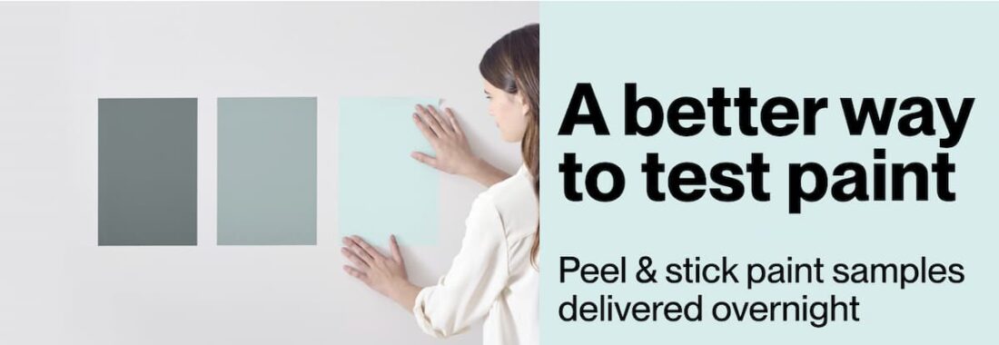
Before you commit to a gallon, always test your top 2–3 colors in the actual room. Look at the swatches during different times of day and next to your existing furniture, flooring, and fabrics. Lighting and undertones can shift.
Love the Pottery Barn Wood Finishes?
Want more help choosing the best paint color for your space? I’ve tested hundreds of shades over the years and share my go-to favorites, painting tips, and home styling tricks here on the blog to help you decorate with confidence.
Hi Tracey – this is a great explanation of the colors. I am trying to get the wall color used in the 2025 catalog, page that had the white sofa and two dark green chairs. I had a suggestion that it was BM Rockport Grey, but the sample I got if that seems too dark. Any help would be greatly appreciated!
You can always lighten a paint color when they add the tint. You can make it up to 75% lighter. Just tell the store you want them to reduce the tint strength.
Hey Tracey, I always look forward to your take on the new colors each year. Is there a Sherwin Williams dupe of “Beach Glass, 1564”? Thanks. I love this years colors and I am super envious of your home. We live on a farm and it’s impossible to have white stuff.
Vicki, I went down the rabbit hole for you and found a random Sherwin Williams color that is really close: Sherwin Williams Silvermist SW 7621 (peel and stick sample). It’s a tiny bit darker and greener, but VERY close. It’s not to be confused with Benjamin Moore Silver Mist 1619 – a totally different color.