
How-to Pick Paint Colors: Step by Step Guide

A step by step guide on how-to pick the right paint color!
Are you feeling totally confused about how to pick the right paint color?
Or maybe you are scared you will pick the wrong color and regret it after hard work or paying a painter to apply it for you?
Luckily, I have a special gift that’s called “color memory” and it is my super power!
That means I see color to a greater degree and remember what I see later.
I am going to use my super power to train you on how to choose the right color using some basic tricks.
By the end you will feel a whole lot more confident choosing paint colors!
My Paint Color Expertise
I feel very lucky that I have color confidence when it comes to choosing paint colors, but it came with LOTS of practice over much of my adult life.
God gave me color memory, but my degree in textile manufacturing, plus career in apparel and home furnishings included matching color standards for brands like GAP, Target and JCrew.
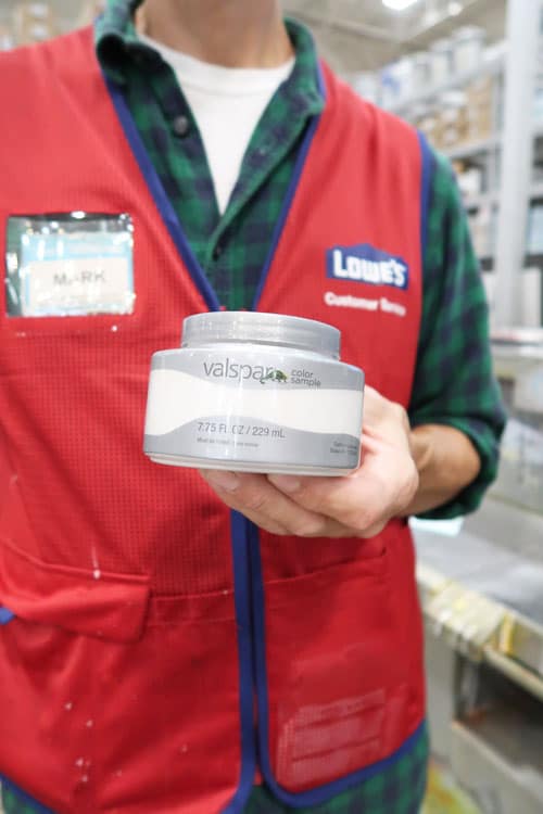
Later in my career, I had 5 years looking a 1,000’s of paint chips while working in the paint industry at Valspar on the Lowe’s Home Improvement team.
It’s made me an expert in color matching and color selection. You are in good hands!

That helps a girl out in selecting paint colors for her home 🙂
The good news about paint is it is non-permanent and with a little free labor it’s easy to change over and over!
Plus there is an endless supply of paint color options too, so you can ALWAYS find a color that will work for you.
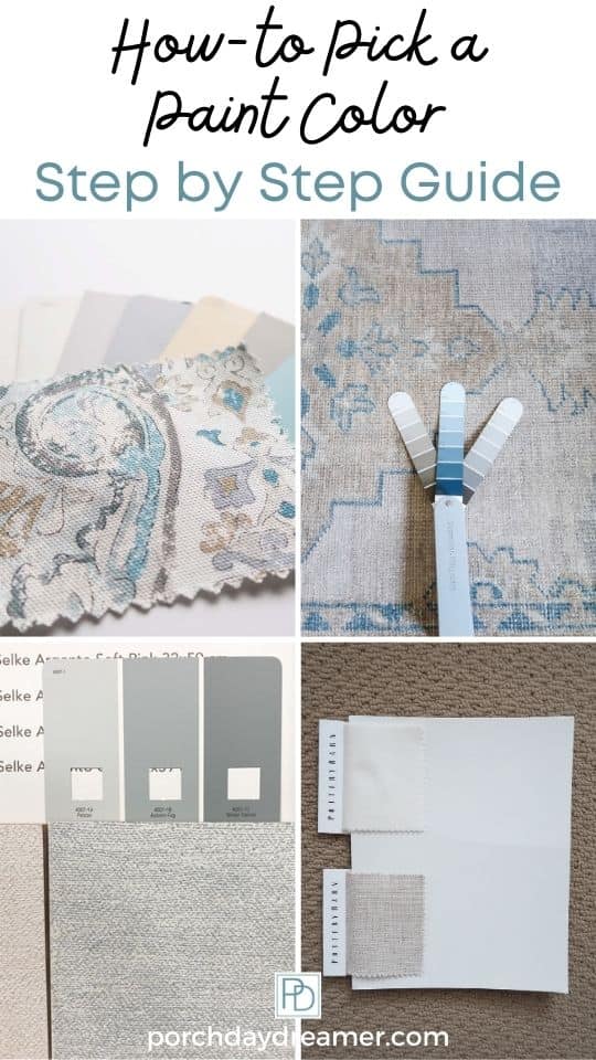
Pin It for Later!
Non-Technical Paint Color Terms
We are going to skip things like hue, value, contrast, etc. because it doesn’t make sense to anyone other than those trained in color theory.
Let’s instead use terms that most people understand to keep this as simple as possible 🙂
For instance if you asked the Lowe’s paint desk associate “I’d like a deeper value of this same color.”
Do you think that’s going to translate most days?
PAINT color terms we will be using throughout this tutorial:
Color = A paint chip/swatch and color of the object you are painting.
Dominate Color = In a multi-colored object, the main color.
Light, Medium, or Dark = The feeling the color creates (dark and moody room or light and airy room).
Natural Light = How much actual sunlight is in the room.
Match = A color that matches another color.
Coordinate = A color that goes with another color.
Color Cast = When something inside the room or through a window changes the color of the paint.
Now let’s start with how you even begin the process of selecting a paint color.
Here are the basic stages in the process to give you an idea of how this works.
6 Easy steps to choosing a paint color:
- Start with a base object to create a color story.
- Find out how much natural light the room receives.
- Determine how you want the room to feel.
- Decide if you want a light or dark paint color.
- What color do you want to emphasize in the room?
- Test the paint color in the room.
- Decide on the paint color!
Where to Start When Choosing a Paint Color
In your own home, you have to start with something to “match” or coordinate” BEFORE you pick a paint color.
PLEASE don’t see a color on Instagram or Pinterest and paint a room that same color.
You must start with an item or object FIRST to determine which paint color will work in a room
EVEN IF YOU ARE PAINTING A ROOM WHITE!
DO NOT PAINT THE WALLS A COLOR YOU FOUND ON SOCIAL MEDIA
That’s my public service announcement for today 🙂
Seriously, you will be SO disappointed if you find a color on Pinterest or Instagram and run with it.
All magazines and bloggers edit their photos and computer monitors plus your phone screen change that color again.
It’s a disaster waiting to happen! The color won’t look the same and it’s just not a good place to start a room design.
In general, this same rule applies if you are making over a room.
You need to start a room makeover with ONE THING…I covered this in How-to Start a Room Makeover
What to Start with when choosing a paint color
- Fabric
- Artwork
- Rugs
- Pottery
- Tile
- Counters
Starting with one thing will help you decide the color story of the room…more on that later.
99% of the time I start with a fabric or a rug in an interior room.
In a bathroom or kitchen I start with the tile and the counters because they are such an important element in the space.
Find one thing to work from and you’ll increase your odds of getting the paint color right the first time!
How to Find Paint Colors for a Room
It’s time to stare and I mean STARE at the item you have to match or coordinate in your room.
- What is the dominate color you see?
- What other colors do you see?
That is the basis for everything.
You will be choosing a color that “goes” with a color in the object.
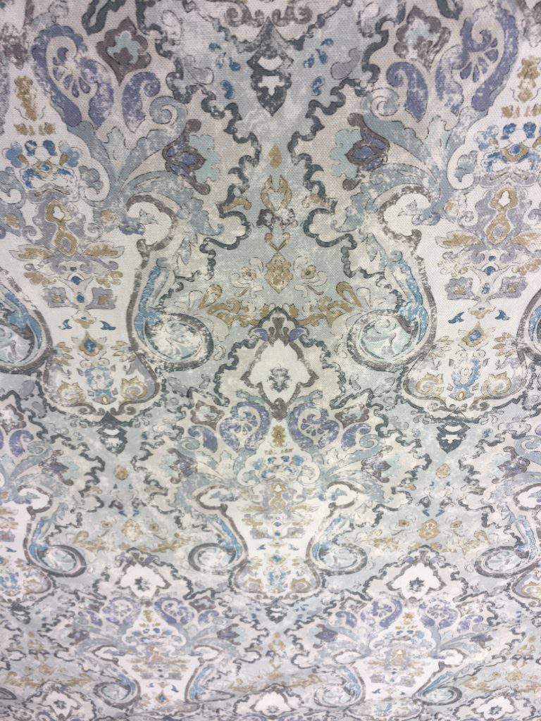
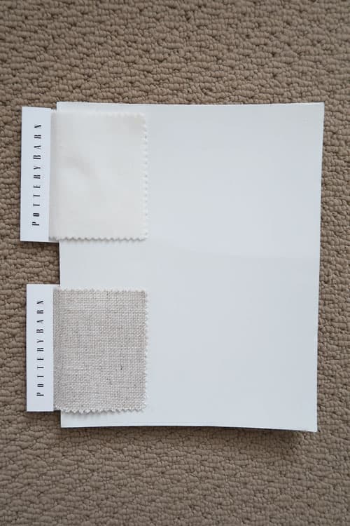
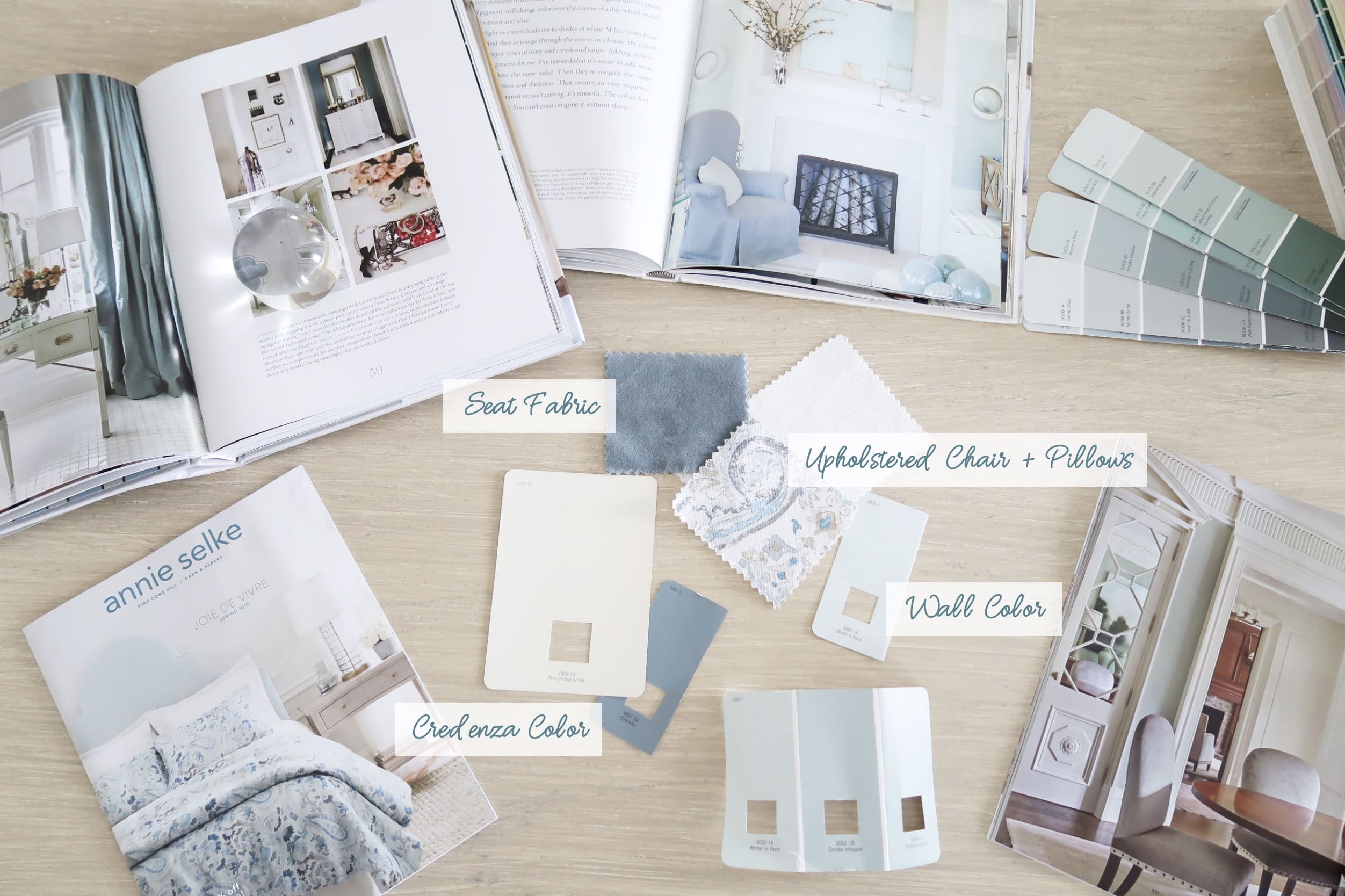
To help guide you and give you a real life example, we are going to work from the main fabric I chose for the dining room makeover.
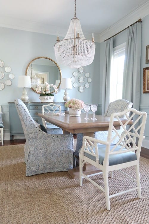
First up, determining the dominate color!
Dominate Color
When I look at this fabric, I see the lighter blue green color first. That’s just because it’s a color I love!
You may look at this fabric and see a dark gray, or tan, or even the deeper shades of blue or teal.
Whatever color YOU see IS the dominate color.
There is no right or wrong answer to the color that is dominate in your eyes – UNLESS you are color blind LOL.
Then this color selection thing is best left with someone else 🙂
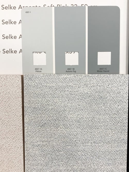
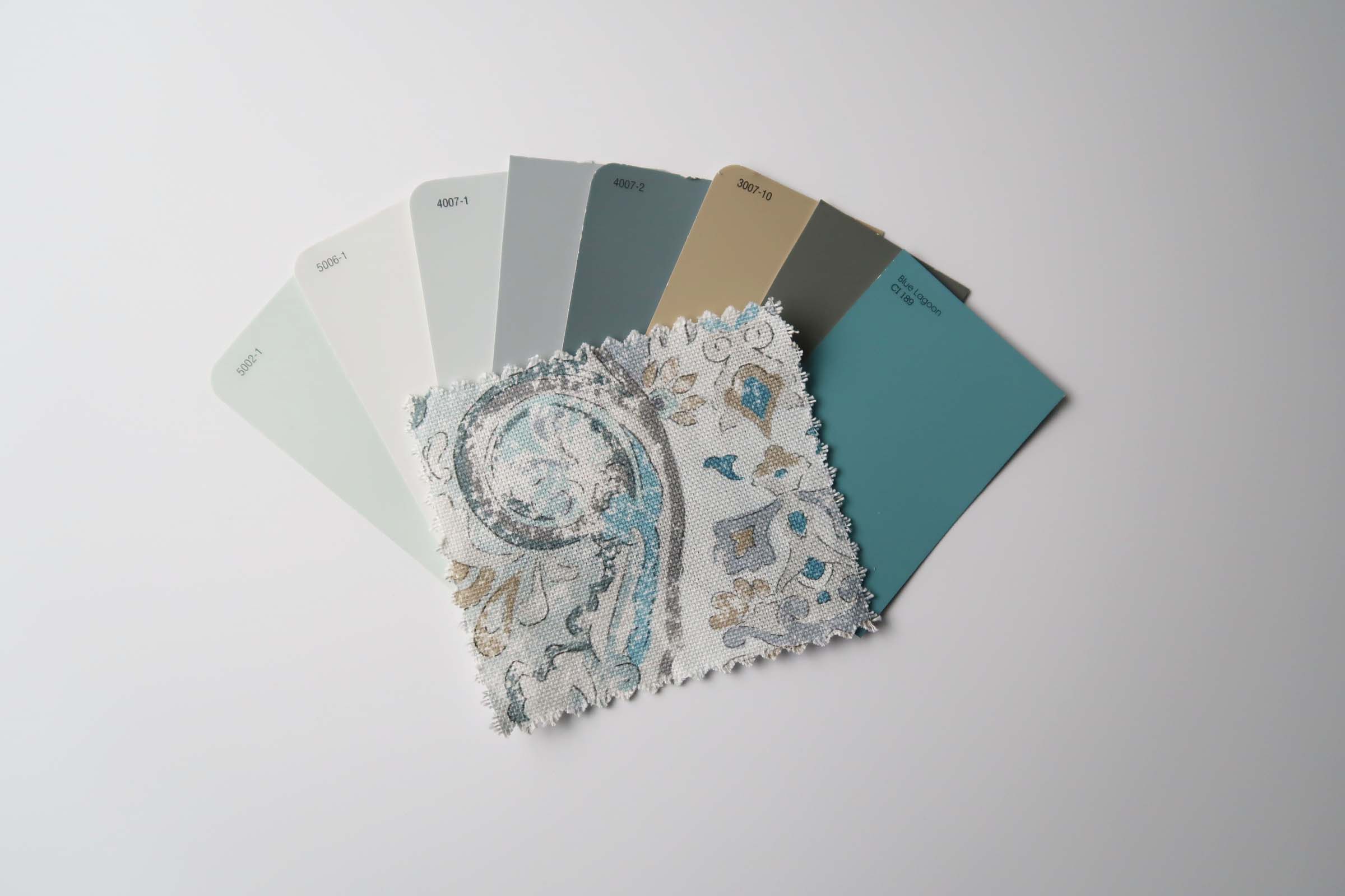
Coordinating Colors
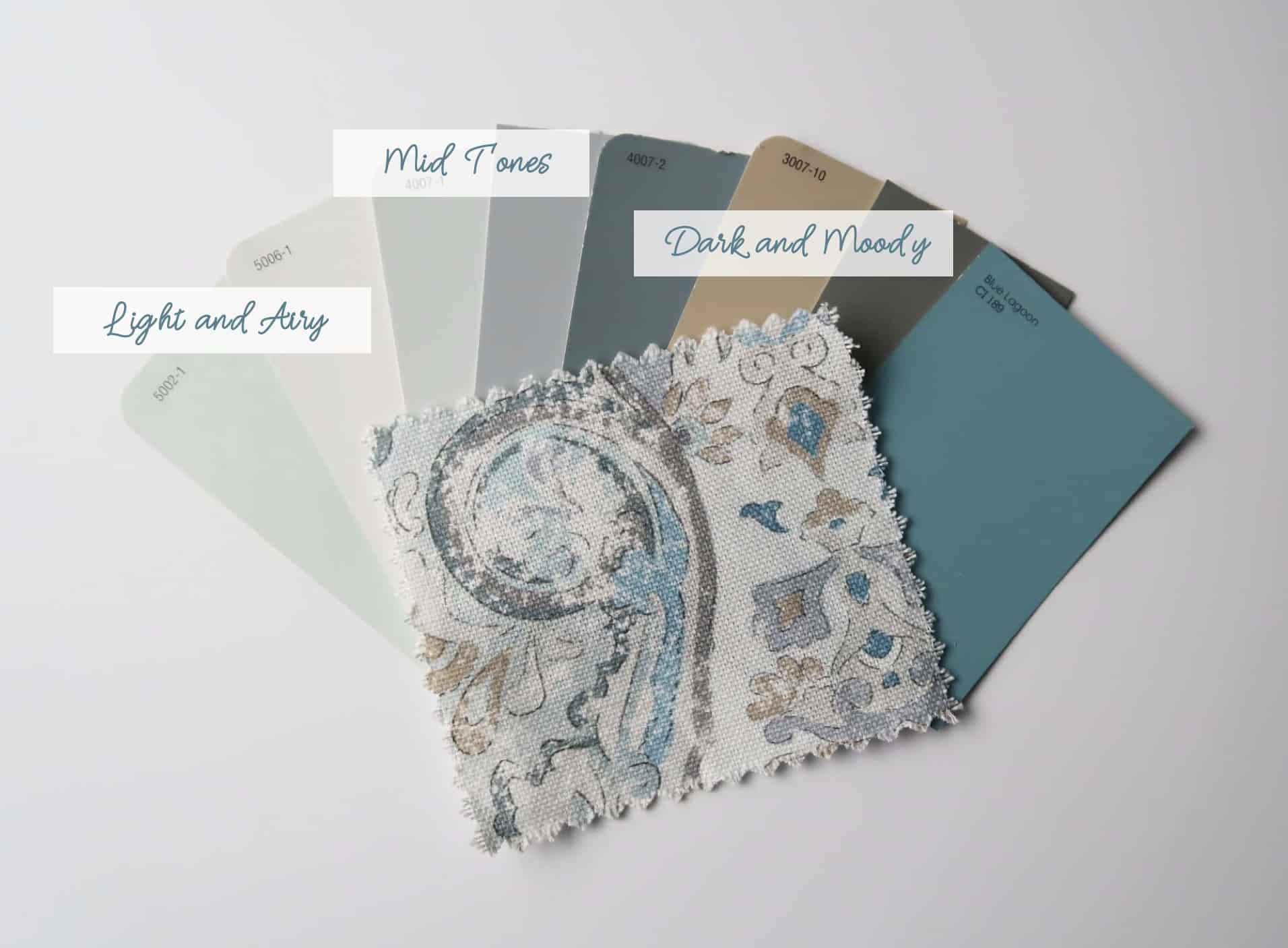
Now I’ll show you all of the colors I found in this fabric that helped me decide what color to paint the walls .
Then what colors in general I wanted to use in the room.
Note: the photography isn’t color correct just a guide.
When I look at this fabric and pulled paint swatches from the store, I found 8 colors to choose from how nice!
You can see it is a WIDE range of colors, which we will have to narrow down using some up coming tricks.
Here is another example using the rug in my foyer which I love and did a whole review: Pottery Barn Finn Rug Review
This is a more simple color story that involves blues, browns and grays.
It all depends on the item that is the base for paint color selection.
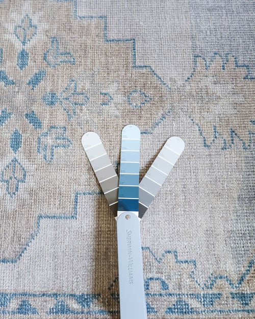
Again…there is no right or wrong answer to what you love or see is the most dominate color.
Choose what makes you happy first and start with that.
If you want some help before you go to the store in narrowing down the paint color options: Seriously Cool Ways to Find Out Paint Colors
There are apps that will scan a fabric or your rug and find a close paint color.
OR maybe you want a really neutral room then you can focus on the fabrics of the drapes or sofa.
That is how I chose the paint color for my family room.
It was important to find a white that worked with the undertone of the sofa fabric and the ivory colored drapes.
The dominate color I focused on was the gray undertone of the oatmeal fabric so I stayed away from white with a yellow undertone.
Next we will talk about how light or dark of a color you desire.
Determining Natural Light
Once you have a general idea of what colors “go” with the fabric/rug/pillow, now it’s time to look at the light in the room.
Using the handy compass on your mobile phone, look to see what direction the room faces that you are going to paint.
My dining room faces almost due North.
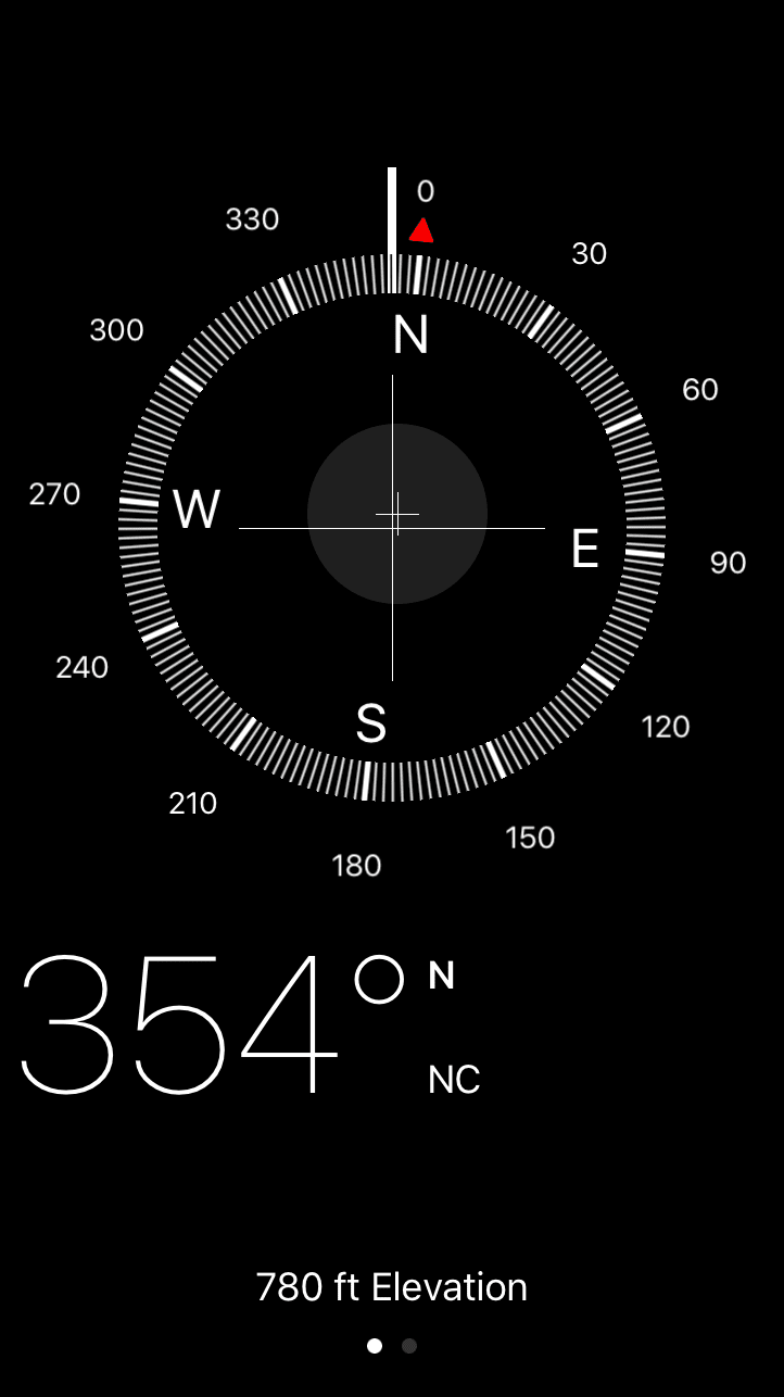
Determining what direction your room faces is going to help you understand how much natural light it receives.
How much light a room gets is very important in picking a paint color.
North, South, East or West
North and south facing rooms tend to be a darker because they don’t get direct sunlight.
East and west facing rooms will get direct sunlight in the morning or later in the day respectively.
How Many Windows?
If a room has a wall of windows floor to ceiling, even if it faces north it will be lighter – like my office and man cave.
If a room has very few windows or small windows, the room will be darker.
How Do You Want the Room to Feel?
Do you want a light and airy, a little cozy, or deep and dark feeling in the room?
That will help you decide if you pick a light shade of paint, a mid tone, or a dark color.
Lighter colors typically will reflect more light in the room and dark colors will absorb the light.
How Light or Dark of a Paint Color to Choose
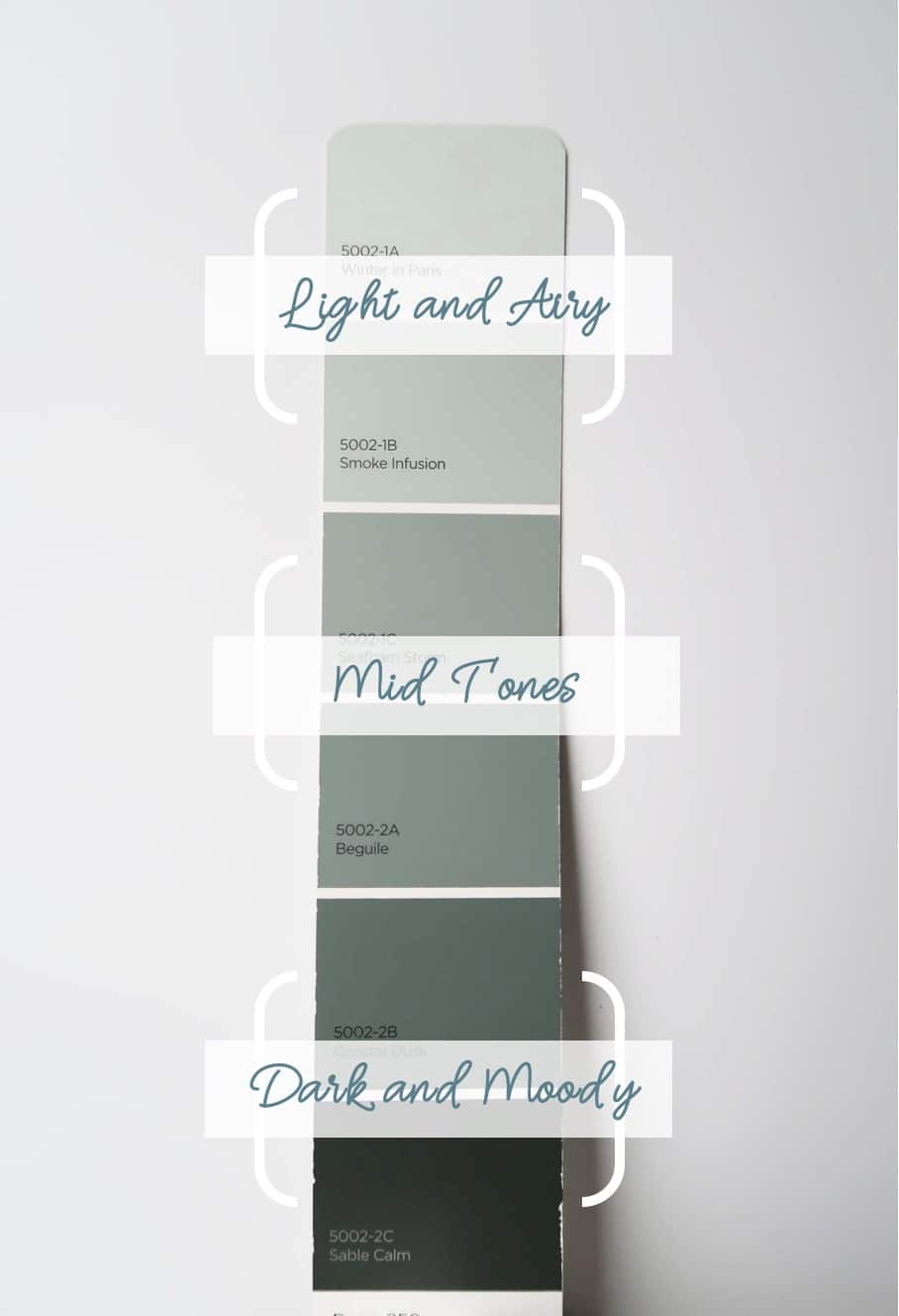
Now that you know what colors work with the decor, the light in the room, and the feeling you want to create it will be easier to focus on the color itself.
Layout all of the colors you found from light to dark.
Each one of those colors can most likely be selected in a lighter or darker version – easy!
Light to Dark Paint Colors
If you know you need to brighten a darker room then pick a lighter color.
If the room seems too bright and you want to make it feel cozier pick a mid-tone.
Or if you really want to make a space cozy or bold, go with a dark and moody color.
- Lightest shades on the paint chip for a light and airy feel.
- Middle shades on the paint chip for a mid-tone feel.
- Darkest shades on the paint chip for a dark and moody feel.
Natural Light Factor
Natural light plays a HUGE role in how dark or light the paint color should be.
The more natural light a room has the farther down into the mid-tones you can go and still have a lighter feeling room.
If the room has very little natural light, realize a darker color will really close in the space.

If that is the look you are going for, then do it!
Sometimes, a deep color used strategically can make a room appear larger by visually “pushing back” the walls.
Here is an example in my power room.
What Color in the Room Do You Want to Emphasize?
Now that you’ve done that exercise what color do you want to emphasize.
The walls are the BIGGEST color impact and will guide everything else you do, so choose something you can LIVE WITH EVERY DAY!
In the example of the dining room chair fabric, there three main color options that I can paint the dining room:
- Blue/Green
- Gray
- Tan
How I made the final paint color selection:
- The room faces north, the windows are narrow, the front porch blocks light to these windows, and drapes block light further. So it’s the darkest room in my home.
- To bring more light into the room with the wall color, I chose a very light color. The easiest way to think about this is on a color chip it is the LIGHTEST color.
- It was important to coordinate with the downstairs of my home and the adjacent rooms were in a light cream color.
- In order to create differentiation, I went with the most dominate color I saw and wanted to emphasize – the light blue/green color.
Test the Paint Color
YES, please spend the money to test the color you chose first.
Most paint samples are around $5 dollars, so it is worth it to test the color in your space FIRST!
Try to paint a large area like a 1ft x 1ft swatch of the colors you are thinking about.
If you don’t want to paint the walls, use white poster board or 8 x 10 foam core board and label the back.
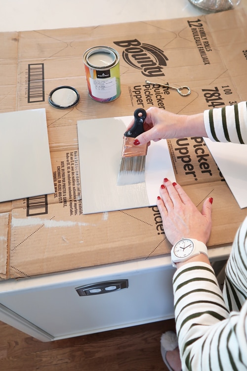
TIP: Choose your final selection on a sunny day!
Wall color will reflect other colors in the room and cast a color onto to other objects in the room.
Try the colors on different walls because each wall will reflect light and the color differently.
The light coming in from the windows will cast a color too – especially if you have trees close to the house or your neighbors home.
It can totally change the paint color, if there is a big evergreen tree by the window or if light bounces off your neighbor’s red house!
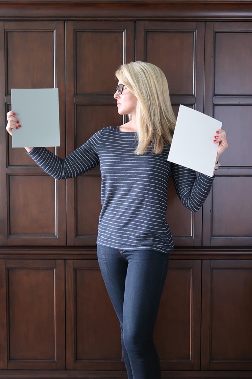
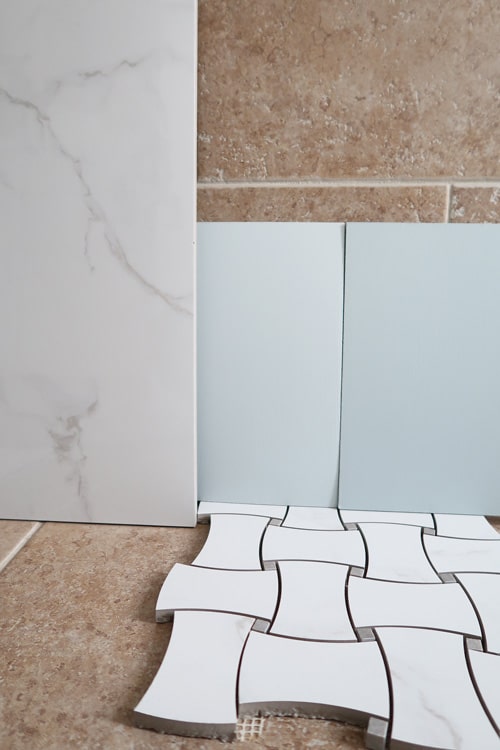
IMPORTANT: hold the paint chip behind any stained wood, tiles, or drapes hanging.
Do you still like it? Does it coordinate or match or even complement other items in the room?
Here are some examples of testing a color against marble and tile to determine if the color is working with what you have.
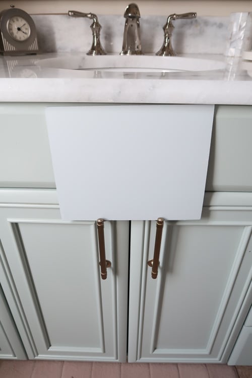
It was important that the paint color worked with the marble counters in my bathroom.
I made sure to hold it up and confirm it was a match to the gray veining.
Watch the color ALL day long. Do you like it as much in the morning and at night?
Does it take on a strange look at various times of the day that you don’t like?
Avoid a color you don’t love all day long!
This process can take days or weeks. Give it a little bit of time and get opinions if you aren’t sure.
It’s decision time and I hope with this guide you found your perfect color!
Paint Sheen Impacts Paint Color
Most of the time, you’ll go with a wall sheen of Eggshell, Flat or Satin.
Know that paint sheen WILL change the color slightly.
To understand Paint Sheen please read this post!
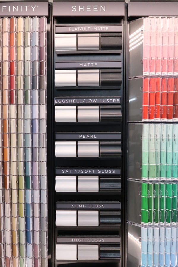
If you sign up for my weekly email newsletter, you can download a paint sheen guide at the end of this post.
You’ll never be stumped again at the paint desk counter 🙂
Get Painting! Mistakes Happen
Seriously, paint is an easy change.
If you don’t love the color, change it while you still have the room prepped!
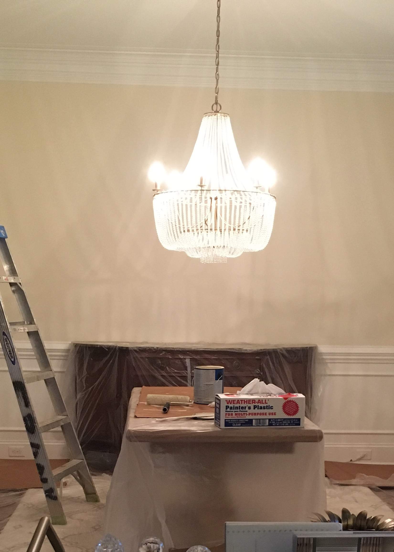
Guess what? I didn’t like the first choice and the one I painted the dining room – a creamy off white.
After all of those white and cream rooms on Instagram, I thought I would try shifting my room away from blue.
NOPE hated it and re-painted it a pale blue the next day. Only $30 wasted and 4 hours of my life. NOT BAD.
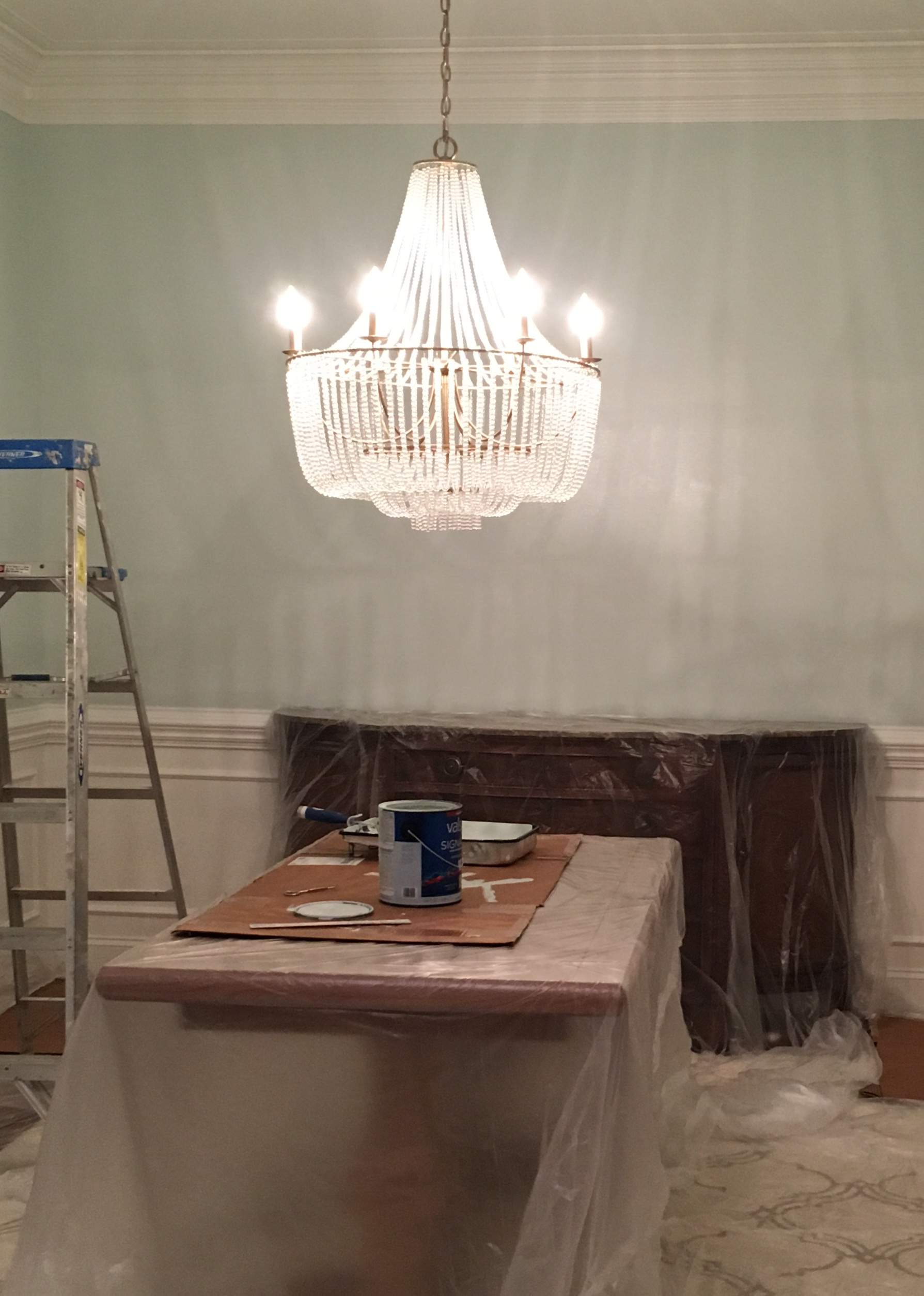
What was the final paint color selected?
Valspar, Sea Salt Blue CI 191
See I try things and make mistakes or don’t love the look. That is real life people! It’s ok!
The first color I painted the dining room wasn’t wrong, but I didn’t LOVE it.
That’s more important than anything…LOVING the color!
WANT TO SEE ME EXPLAIN THIS 6 STEP PROCESS? Watch my Instagram LIVE replay!
You’ve got this!
Please consider following me on Pinterest and Instagram for daily inspiration.
Until next time…
Porch Daydreamer
Tracey
Hi Tracey,
Thank you for ALL you great advice!
I have a question, my kitchen opens to a small family room. I would like to paint my cabinets a sage green. I don’t know what wall color to use to unite the kitchen with the family room.
Do you have any suggestions?
Glad you found the information helpful, but I am not able to specifically choose a color for you. This post may be helpful: 2021 Cabinet Paint Color Trends. I have coordinating whites that may work or visit all of my paint color posts.
Thanks for such great information (as always!) I’ve bookmarked it for future reference. Do you have any similar information for choosing outdoor paint colors for a house? I’m losing my mind just trying to choose a color for my entry door. My house, trim and shutter colors are fixed and can’t be changed because they’re vinyl:: white clapboard style siding and trim on a small, 117 year old cottage, grayish blue green shutters, (once forest green but have faded) a medium-toned taupe architectural shingled roof. Door is buckskin color now, with a leaded glass top section. Faces north, in western North Carolina. Any advice as to how to choose a different door color? I would surely appreciate it!
Hi, Donna! Thank you. I haven’t written an exterior paint color post yet, but my advice for you is…when in doubt paint a front door black 😉
Thank you, Tracey, for replying! …I really have never considered black because of the brown roof. Seems like it would clash, but what do I know? I’ll look forward to your post about choosing exterior colors, whenever you get around to doing one. Surely enjoy all of your articles! You are one inspiring and busy lady!
Thank you! My neighborhood has so many interesting combos that I can use for inspiration 🙂
I bought samples of Valspar Swiss Coffee to paint my cabinets. It looks very white, it makes me wonder if they tinted it correctly. It is not close to the color on the paper paint sample. I’ve painted different areas of the kitchen and it looks the same. It dosen’t look like yours. Will it look different in cabinet paint? Should I buy a satin finish for cabinets? Any comments will be appreciated.
I look forward to your article every week. Thank You!
Hi, Mildred! I’d head back to the store and have them double check for you. It is a very bright white to me – much brighter than other whites in my home. Did you see my recent post on white paint colors? There is a video showing the differences between some of the whites in my home. If they tinted the sample into the Sherwin William base, ask them to use the Valspar sample base. Sometimes that can cause issues. I used Valspar Cabinet Enamel Semi-Gloss Swiss Coffee on my cabinets and Valspar Signature Eggshell on my walls.
Hi Cindy, I am having to work with what I have. Would love to update my dinning room. I have a red Accent wall, the furniture is cherry. I don’t have a table in there yet. I would like have colors that work with the red wall. What color could I paint my cherry hutch?
Hey Cynthia! It’s hard for me to give decorating advice remotely, but I’ll tell you that I used to have red walls in another house and mixed it with tan or khaki. It looks really sharp and clean. Plus it would brighten the space. Hope that helps!
Yes tracey, can yiu tell me what the name of the pale blue paint is in this picking a paint color post? The one where you changed it from the cream color to the pale blue. I love that color😊
Cindy, happy to help! I LOVE that color too and it is in my kitchen and on the ceiling of my kitchen and family room. That’s why I thought it would be perfect, but it changed so much in the dining room. Valspar Winter in Paris 5002-1A.