
Best BLUE Paint Colors with Home Tour
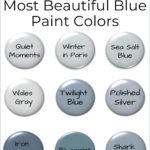
Looking for that perfect shade of blue paint for your home? Sharing all of my favorite tried and true blues!
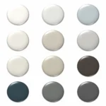
The number one question I get asked on social media? What is that blue paint color?
Blue paint colors are hot this year, especially for kitchens as I’ve documented in my Color Trends Analysis
A room painted in a pale shade of blue is so soothing or in a deeper shade can have a dramatic effect.
Finding that RIGHT shade of blue I know can be difficult, so here are some tried and true colors I’ve used in my home.
How to Choose the Best Shade of Blue
The nice thing about shades of blue is they can be used in any room of your home.
Blue reflects the sea and sky. The good news is blue goes with EVERYTHING!
But how do you find the best shade for your home?

Not everyone wants a room to look like a baby boy’s nursery.
By the way pale blues are the HARDEST color to get right.
How to NOT choose a blue paint color?
Off of social media, from a catalog, or magazine! Seriously, save yourself a TON of heartache and money.
If you aren’t sure on choosing a color in general read, Stop Worrying and Pick a Paint Color
We bloggers posting on Instagram like to make our pictures look light and bright. Magazines and catalogs manipulate light too.
Using Lightroom presets is our go-to, but that means it alters the color by the time you see it on your phone or computer.
Also, know that everything in a room or light through a window changes paint color too.
Don’t be buying a paint color based off a pretty picture, OK?
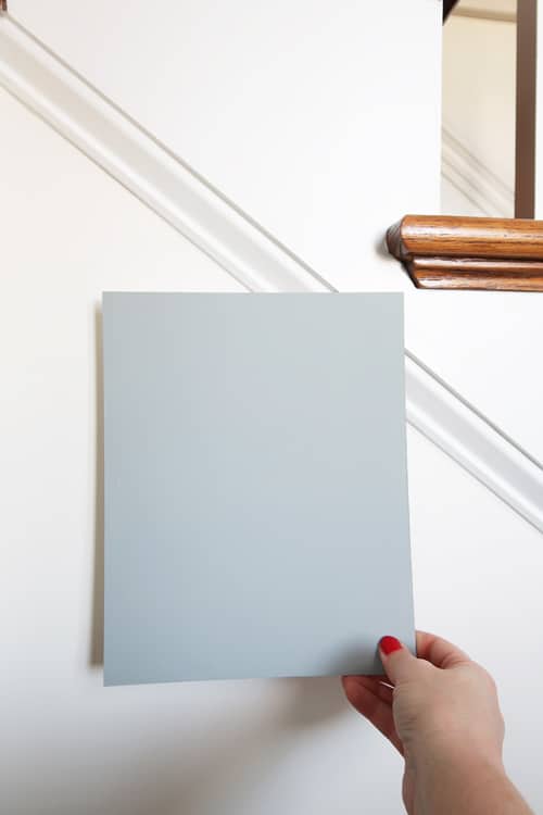
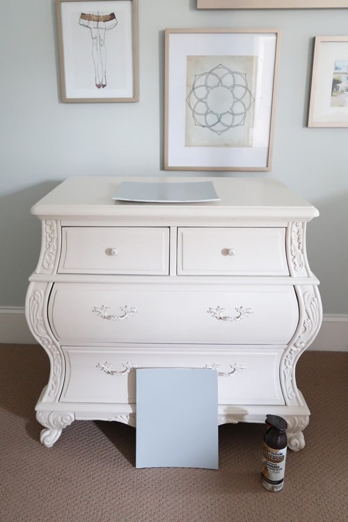
You can START with a color you find from someone like me, but then you must buy a sample and paint it on a board.
It’s $5 dollars and 5 minutes to take the time to sample a color on a few foam core boards.
Live with the color for a few days in different lighting to make sure it works in YOUR HOME!
Check out these helpful posts!
Yes, I do this with furniture too! Painting furniture is a lot more work, so it is critical to test before painting.
I’ll get off my blue painted soap box now and get on to the pretty blues from around my home.
Best Blue Paint Colors to Try
Let’s look at ALL of the rooms, where I’ve used a blue shade of paint:
- Exterior siding
- Dining Room
- Powder Room
- Kitchen
- Master Bedroom
- Master Bathroom
Some of the rooms even have the ceilings painted blue!
Then there a few furniture pieces featured too:
- Foyer table
- Dining room credenza
- Master bedroom nightstands
Yes, I am a blue person for sure! Plus my home is open concept, so making sure the colors flow from room to room is critical.
NEW HELPFUL PAINT COLOR POSTS: Dusty Blue Paint Colors: 8 Go-to Picks from Sherwin Williams and Stop Picking the Wrong Paint Color Undertones
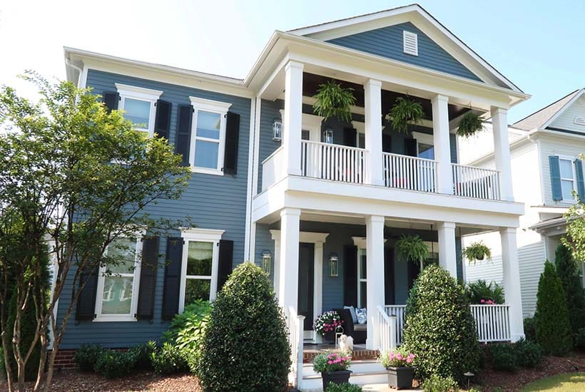
Exterior Dark Blue Paint Color
Here is the exterior of my home in a deep blue with black and white accents.
The color was chosen to evoke a coastal southern charm.
Read all about how I improved my home’s curb appeal and the easy project you can tackle at your house in one weekend.
home exterior blue Paint Colors
Home Siding: Valspar 4007-2B, Iron Frost
Front Door Color: Valspar 5011-2, Very Black
Exterior Trim: Valspar 7006-2, Ultra White
If I had to do it all over again, I’d still choose a deep blue for the exterior of my home.
It makes the landscaping and outdoor decor pop!
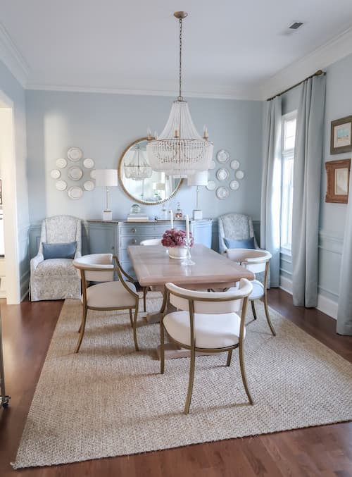
Dining Room Medium Blue
My dining room has actually been 2 different shades of blue.
If you’d like to see what it looked like 10 years ago, read 10 Year Before and After Home Tour with PAINT COLORS!
Colors shift overtime and the more current pale blues have a nice gray undertone.
You can see how this color has lasted over time as I redecorated.
The dining room was very traditional and now is more transitional with the updated chairs.
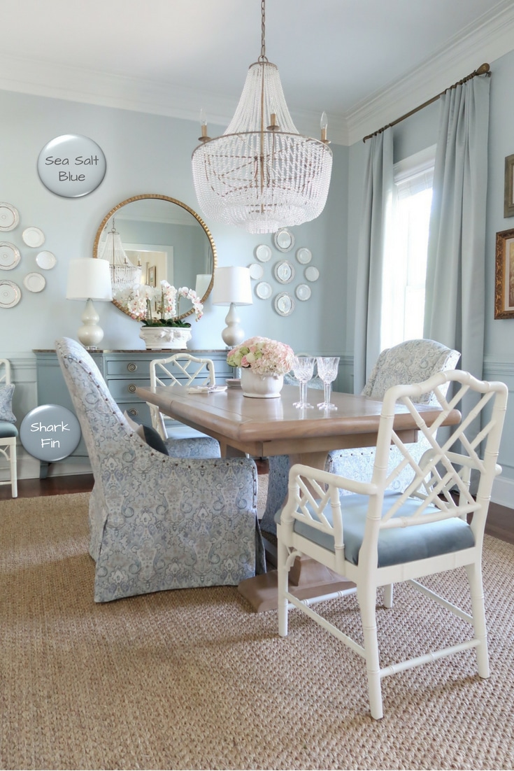
dining room blue Paint Colors
Wall Color: Valspar CI191, Sea Salt Blue (this color is discontinued ask Lowe’s to find the color in the database)
Credenza Color: Valspar 34007-2A, Sharkfin (this color is discontinued ask Lowe’s to find the color in the database) and custom wash tutorial
This is by FAR the room I get asked the most number times: what is the wall color?
It’s the best combination of blue, a bit of green undertone, and gray.
The wall color pulls together all of the blues in the room from the furniture to the fabrics.
Powder Room Deep Blue
The powder room was my first remodel project in this house and then I got hooked!
Because I wanted a more dramatic look in the room I chose a deep blue.
In a small room, a deep color on the top third of the wall visually pushes the walls back making it appear larger!
Modern Coastal Powder Room: REVEAL
powder room blue Paint Colors
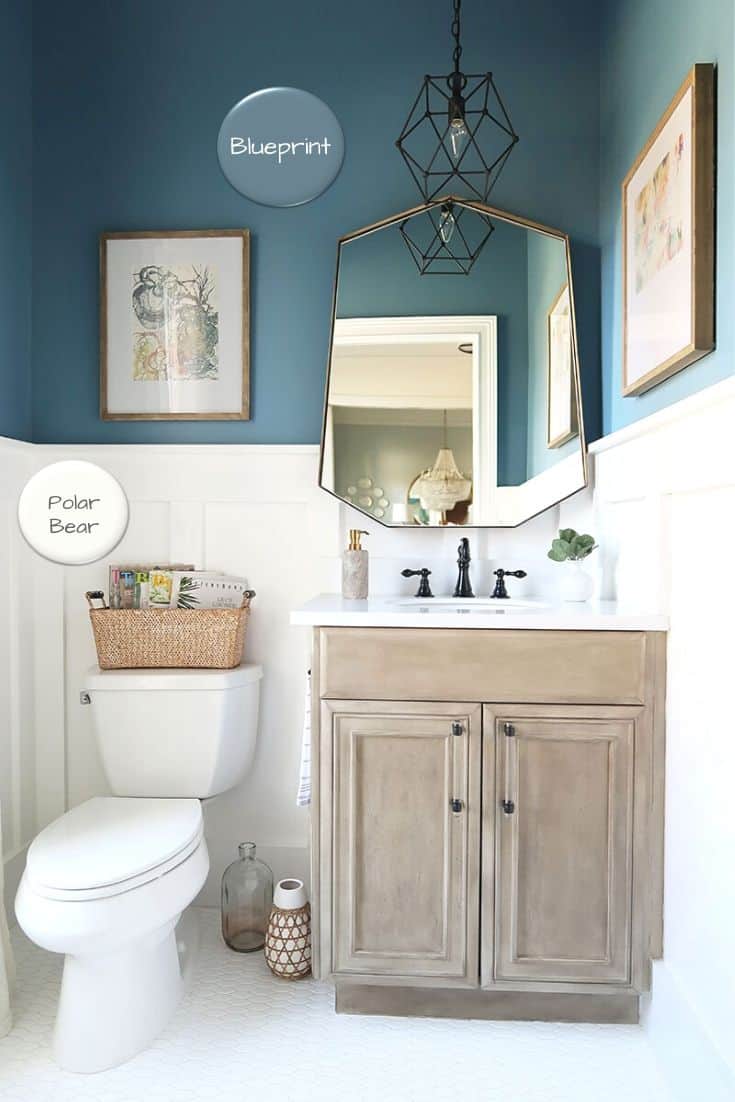
Wall Color: Behr, Blueprint S470-5
Trim Color: Behr, Polar Bear 75
Cabinet Color: Sea Drift Faux Tutorial
This was the perfect place to try something new and the right room to go really dark.
Having a white board and batten keeps the room light and airy for a modern coastal feel.
Just outside of the powder room sits a pretty table also painted in blue!
Foyer blue Paint Colors
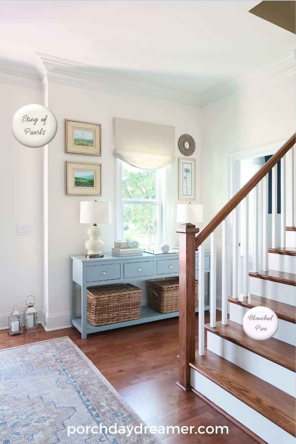
Wall Color: Valspar, String of Pearls CI198
Foyer Table Color: Valspar, Blue Twilight 5001-1C
Stair Risers: Valspar, Blanched Pine 7005-15
Painting the stair risers in this space made everything look lighter and brighter.
I’ve got a great tutorial, if you are thinking about painting your stair risers:
How-To Prep and Paint Stained Stairs White
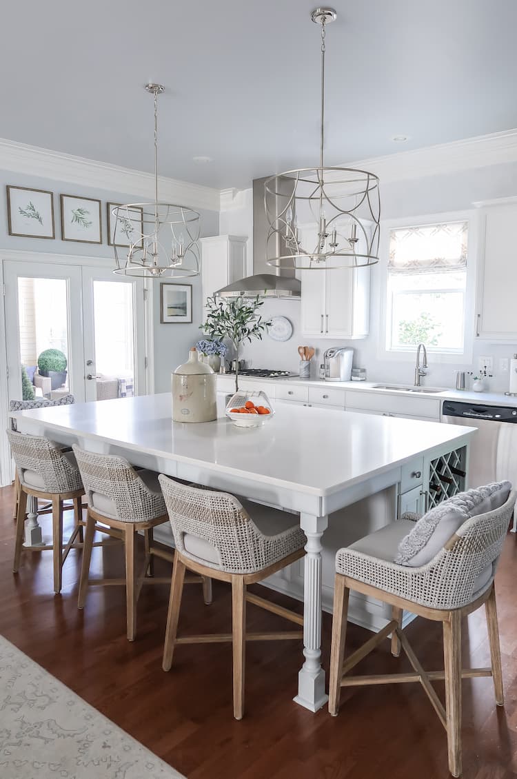
Kitchen Pale Blue
My kitchen photo will be a great example of what I was explaining before and how colors can look different.
Both the wall and the ceiling are painted the same color, but they don’t look the same do they?
Much of that is due to the reflection of the sun coming into the room changing the blues slightly.
No Way I Was Using Marble in the Kitchen! and Kitchen Remodel Facelift REVEAL!
Kitchen blue Paint Colors
Wall and Ceiling Color: Valspar4007-1A, Pelican
Cabinets: Valspar 7006-17, Summer Gray
Island: Valspar4007-1A, Pelican
It’s fun to have the ceiling painted blue! Everyday I feel like it’s blue skies ahead 🙂
Primary Bedroom Pale Blue
This fall I did a mini-makeover of the master bedroom that ended up changing the entire look!
The original blue in the room started to look stale and outdated, so I opted for a more grayed blue.
It’s honestly the prettiest and softest blue I’ve even seen and it is so easy to decorate around as well.
Read all about my primary bedroom makeover here
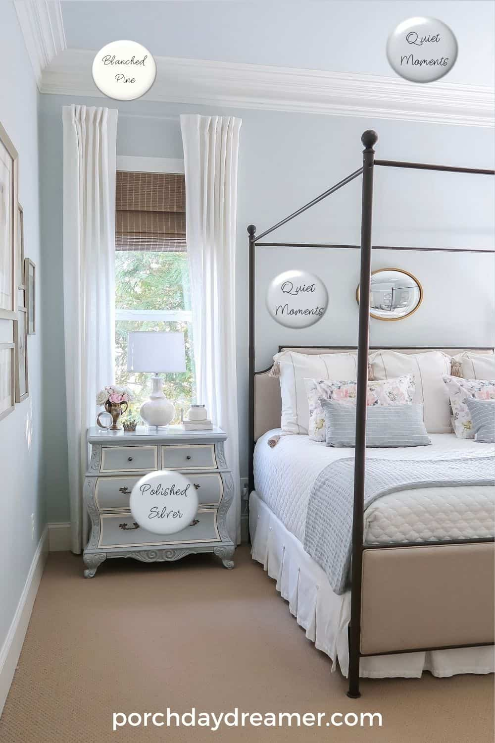
Bedroom blue Paint Colors
Wall and Ceiling Color: Benjamin Moore, Quiet Moments at 50% 1563
Furniture Color: Valspar, Polished Silver 4008-1B [paint tutorial here]
If you click through to the swatches online of both of these paint colors, you will see how different they look in my room.
Blues really do reflect everything around it to change slightly.
When it is a cloudy day, these colors look a lot darker but on a bright and sunny day like this picture they look paler.
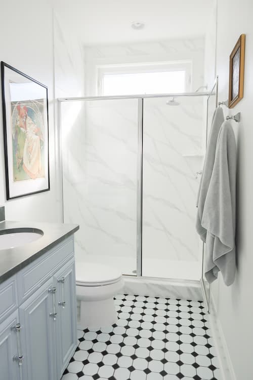
Primary Bathroom Medium Blue
Since this room is off the master bedroom, I wanted both room colors to work together.
They are both Benjamin Moore, which I find to be very saturated colors so I reduced the tint strength by 50% to make them lighter.
It’s odd that when I painted the sample, this color looks like it has some green in it.
Read all about the bathroom remodel here
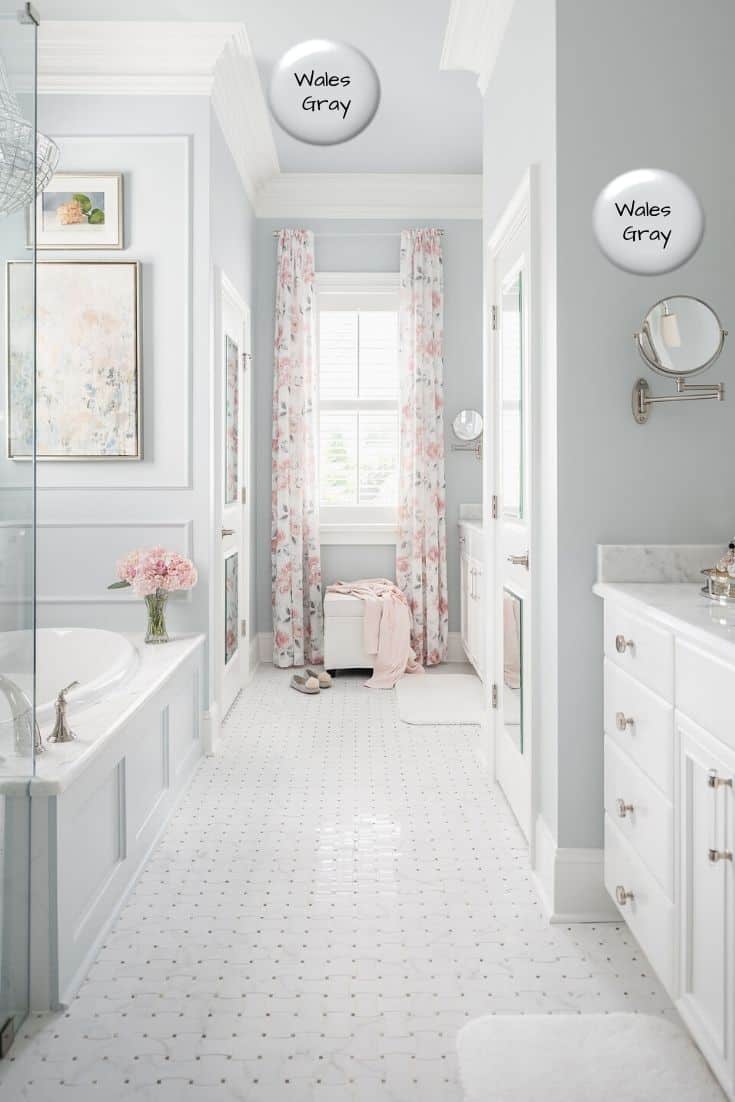
Primary bathroom blue Paint Colors
Wall and Ceiling Color: Benjamin Moore, Wales Gray 1585, Value 50%
Cabinet Color: Benjamin Moore, Decorator’s White OC 149
Trim Color: Sherwin Williams Pure White 7005
Someone just emailed asking about this after testing a sample to ask if my walls look green. It’s an odd phenomenon indeed.
I’d say this photography isn’t true to the actual color and it looks more purple due to a flash that was used during photography.
The color is a very nice gray blue that looks perfect with marble and the charcoal gray fleck in the mosaic tile.
There isn’t any green undertones to this paint color.
Guest Bathroom Medium Blue Cabinets
When I made over the guest bedroom in the most beautiful blue green paint color, the guest bathroom was in serious need of a refresh!
It was entire beige! You can read about my $400 bathroom makeover here.
For the cabinets, I wanted to find a beautiful mid-toned blue for a pop of color against black and white.
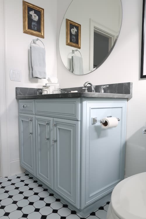
guest bathroom blue Paint Colors
Wall Color: Sherwin Williams, Pure White 7005 (it’s one of my favorite whites)
Cabinet Color: Sherwin Williams, Neibla Azul 9137
Trim Color: Sherwin Williams Pure White 7005
It’s the prettiest clean blue I’ve found that works with cooler tones.
The color reminds me of chambray from Pottery Barn and I actually got the color from some pillows and towels I have in that color.
It’s soft and not to bright, so you could use it in a kitchen too. It’s one of my new favorite blues!
Hopefully, you’ve found a beautiful blue for your home or at least have a running start!
Want more paint color ideas?


Thank you for your lovely content! I am about to begin remodeling our house in primarily blue. Do you mind sharing the name of the first paint swatch you showed with the red painted nails on your hand?
Hi, Nora! Happy to help. It’s one of my favorite colors Benjamin Moore Boothbay Gray. I talk about it in this post about testing paint colors, if you want to see more of this gorgeous color!
How did you ever think about using the BM colors at 50%. I love BM and was going to use quiet moments in my new kitchen because I love the color, but it just turned out to be too dark. I would have never in a million years thought of doing it at 50% which I had, it would have saved me a lot of headaches and expense in finding the right color. I finally came up with SW Sea Salt.
Hi, Renee! Well, I worked in the paint industry and know ALL about colorants plus tinting paint. Just my expertise helped me know that this was an option.
Thank you for the lovely tour! Could you please tell me which brand of paint is String of Pearls and also Malted Milk?
Thank you for your help!
Hi, Nana! Each paint color is listed under the room picture with the brand and color number. Plus they are clickable links that will take you to the color on the manufacturer’s website. Both of those are Valspar.
Your home is beautiful! I went to the Valspar website to take a closer look at the Iron Frost shade that you used for your house exterior, and it looks like more of a dark gray than a blue? Although it does definitely look blue in your pictures. Does it look more gray in certain lighting, do you think?
Thank you! As I mention in the post, you really need to go get a paint chip and then sample to see how it looks in person. I find colors on Valspar’s website to be very far off from what they look like in real life. My house is definitely dark blue.