
BEST Blue-Green Bedroom Paint Color: Cottagecore Reveal
Revealing the guest bedroom makeover using Cottagecore aesthetic interior design style.
You’ll love the blue-green paint color I used for the bedroom!
It’s the perfect backdrop for the furniture and artwork in the room.
It is the most perfect shade, with gray undertones and is a versatile color even for furniture (I’ll show you why).
Finding the Perfect Paint Color for the Guest Bedroom
Deciding the wall color for any room is always a challenge especially for a small space like a bedroom.
I had good reason to worry because this guest bedroom makeover was for my mom. If you want to read the Cottagecore Design plan click here.
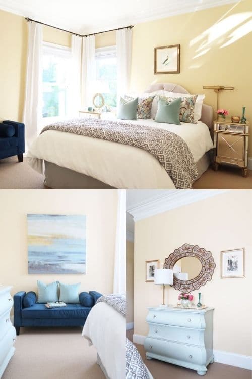
I was ditching the yellow and teal color palette for something more soothing.
Plus find a paint color that looked good with the adjacent rooms and worked with the neutral shades of fabric.
It was important to create a tranquil space and find the right hue that would work with the wood tones of the furniture.
Here are the before pictures for reference of the spaces I needed to update.
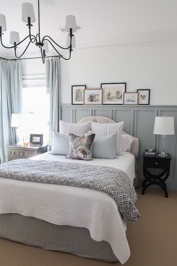
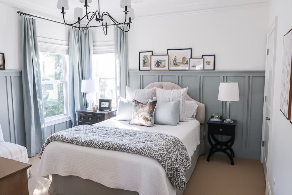
The BIG update for the room was adding board and batten trim, with a picture shelf ledge.
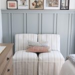
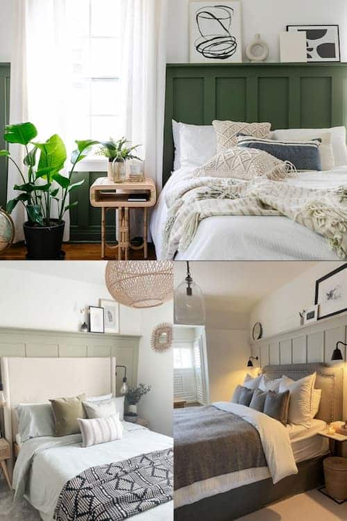
You can see this in action in my inspiration bedrooms.
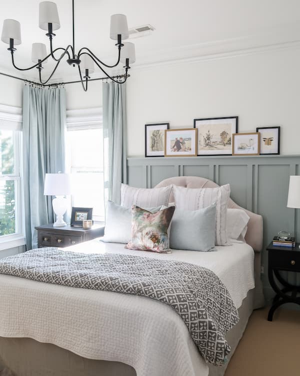
Luckily, I had the most beautiful drapes in a lovely shade of what looked like light blue.
As I was trying to match paint colors, I found the drapes had a hint of light gray mixed with green too.
Since the bedroom is a small room, I wanted to use a pop of color on the lower two thirds of the wall. Interior designers use this trick especially in smaller rooms.
Mid-tone to dark color on accent walls help to visually push the walls back making the room appear larger than it is. I did this in my powder room makeover with a dark blue green paint color.
Looking into the guest bedroom I wanted there to be an accent wall that was a focal point not only behind the head board, but also in the sitting area of the room.
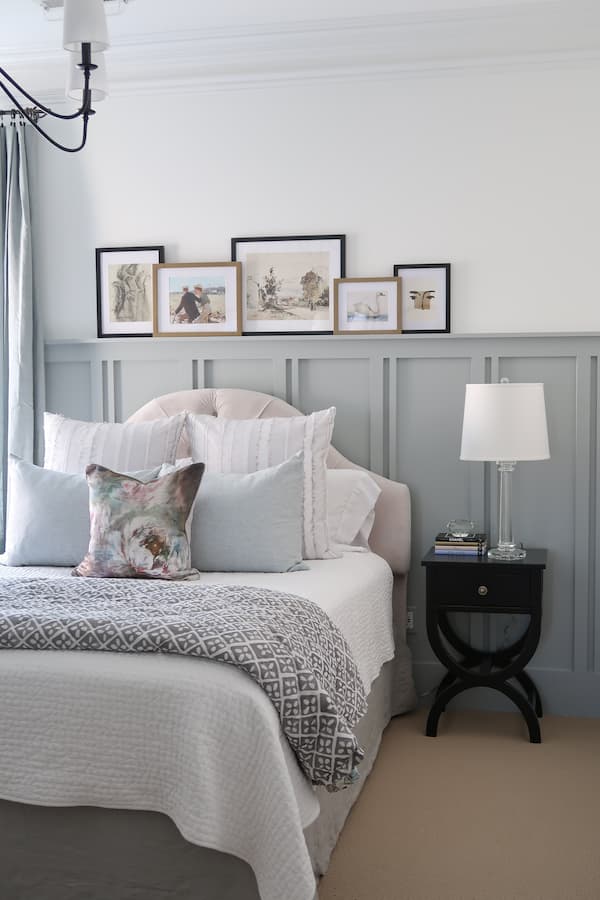
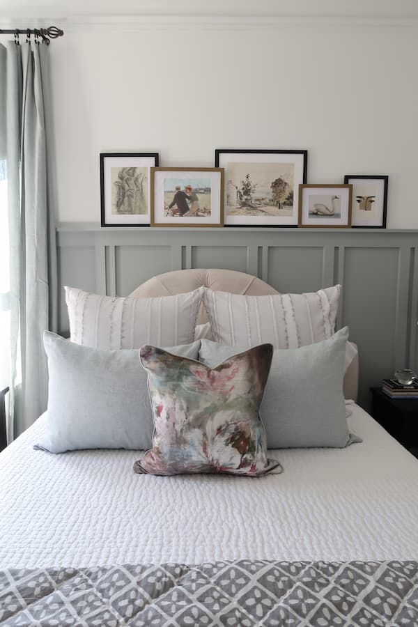
To save money, I kept the gray headboard and bedskirt plus gray and white bedding.
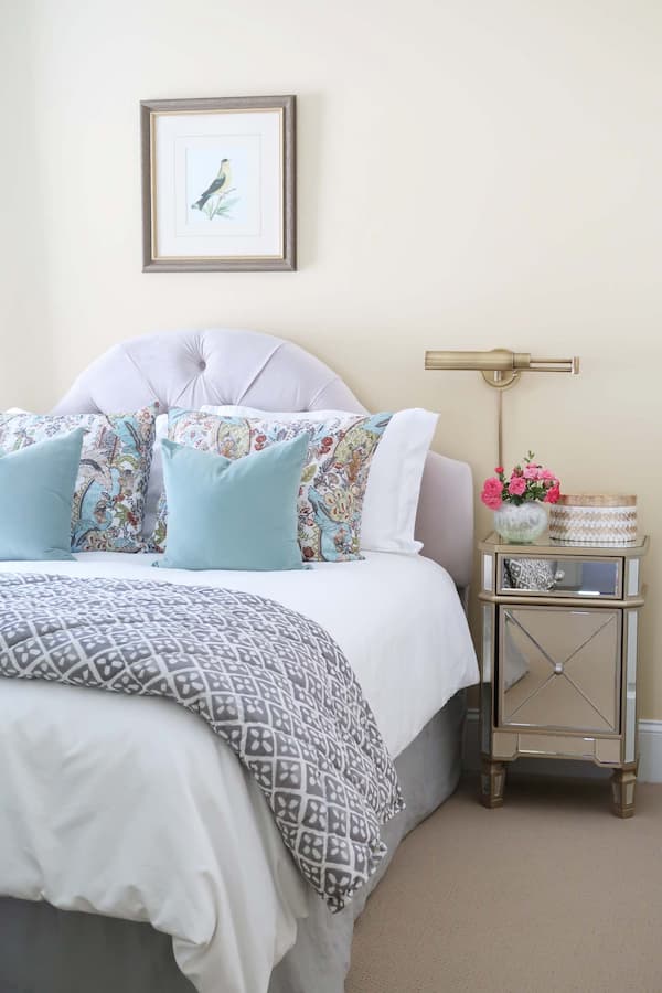
I needed a color to complement the bedding too!
Best Blue Green Paint Color
The 2021 color of the year Benjamin Moore Aegean Teal put blue-green hues in my mind! Unfortunately, that color didn’t work with my drapes.
What is particularly nice about a blue green is it acts like a neutral going with a wide variety of other colors in the room.
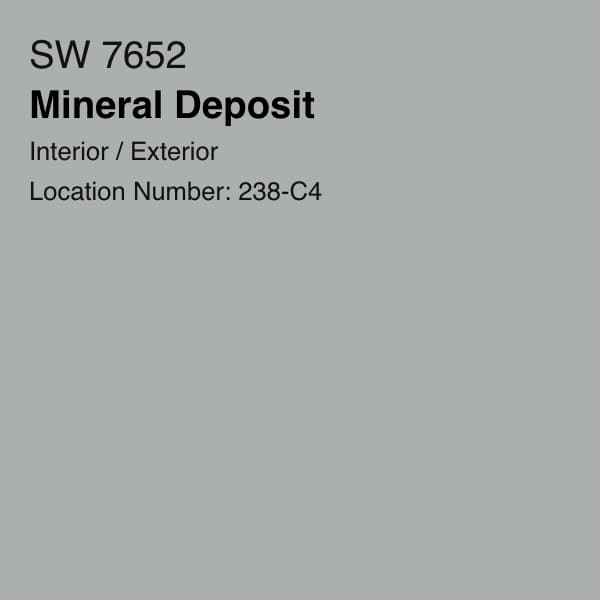
After testing a variety of paint samples in blue-green paint colors the perfect choice was Sherwin Williams, Mineral Deposit in a semi-gloss finish.
It literally looks like I had it custom made to match the drapes creating a sophisticated monochromatic look!
Sherwin Williams Mineral Deposit is the perfect balance of green and blue with a gray undertone.
Porch Daydreamer
It’s definitely more on the green versus blue side of the spectrum and a darker value than what I typically use for walls.
The room gets a lot of bright light throughout the day that allowed for a deeper shade.
No matter what time of day, the paint color looks soothing and is a relaxing color. Perfect for a guest bedroom!
I knew the cottagecore artwork would look beautiful on the blue-green board and batten.
For the upper portion and secondary walls, Mineral Deposit paired perfectly with Sherwin Williams, Pure White in eggshell.
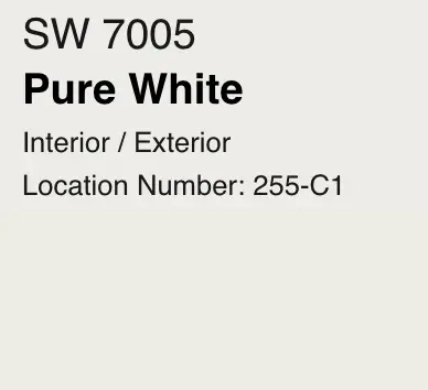
This is my NEW favorite go to white that literally goes with any color cool or warm.
The cool tones in the paint looked perfect with the brass accents in the hardware on the nightstands.
Ready for the reveal???
Contains hand selected products, with affiliate marketing links where I may earn a small commission if a purchase is made. {full disclosure here}
Cottagecore Guest Bedroom Reveal
The best part was surprising my mom with the makeover!
She LOVES it and said it is so English and so ME…best words ever!
Can you believe what a perfect match the blue green linen drapes are to the Sherwin Williams, Mineral Deposit paint?
You can see how the color acts a a neutral back drop for the variety of finishes in the room.
Along with the blue green paint color, my favorite part of the whole room is the board and batten with the picture shelf ledge.
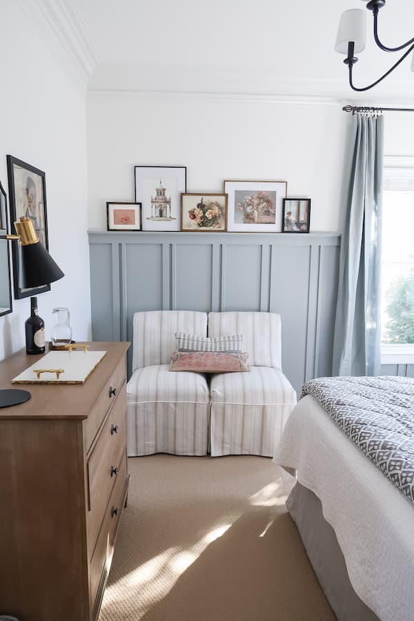
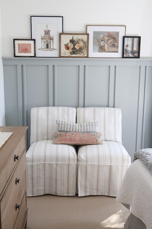
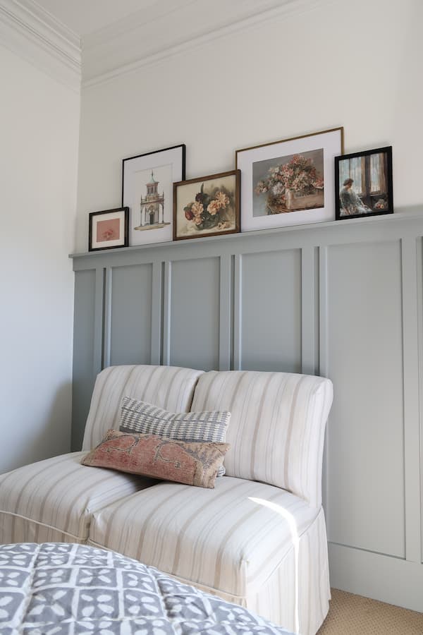
Using 1 and 2 inch vertical boards I created a pattern to reflect the stripe in the chair fabric. (here is the tutorial on how to map out board and batten pattern!).
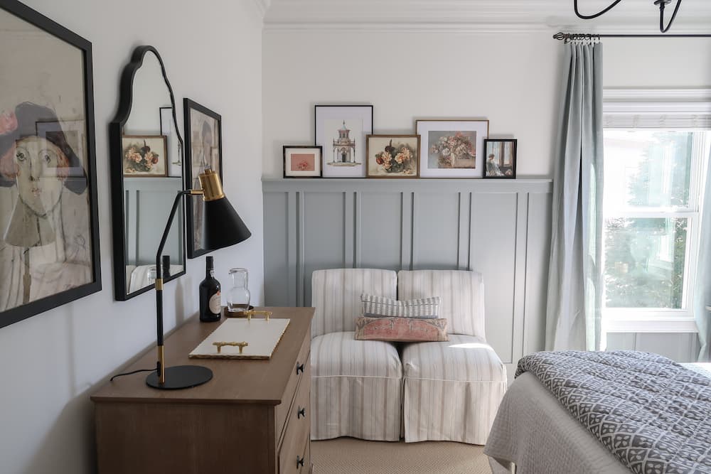
The chairs were an attic treasure from my family room makeover and look perfect in this room!
The great thing about a picture ledge is you don’t have to hang ANYTHING!
Artwork is simply propped up and it is an easy update to swap out pieces of art in the same frames.
I printed Cottagecore artwork from Etsy to fill the frames and give the room life and color.
An inexpensive way to frame artwork and have a variety of finishes, is to use raw wood picture frames and spray paint them!
All of the frames I finished myself, so I could pick and choose how many of each color I wanted and determine what would look best with each piece of artwork.
My mom loves to rearrange things, so it is a little treat for her to play with the art on the ledge.
Guest Bedroom Special Touches
One of my FAVORITE finds was the inexpensive black 6-arm chandelier that is a knock off of an expensive Pottery Barn chandelier.
I had to put it together, but for the price it was WORTH it! Adding the white shades traded up the look and softened the light in the room at night.
Looking for an affordable dresser in a weathered wood finish? Here is a great option!
Since this is a guest bedroom, it was important to have a place not only to put away clothes but have a vanity too.
The black arched mirror was a unique find and complements the cottagecore feel.
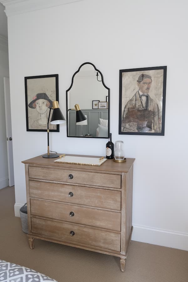
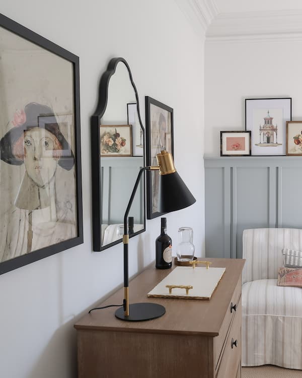
By adding a marble tray guests can place their makeup without worry and use the mirror as a place to get ready.
The black table lamp with gold accents adds a little modern touch and extra light in the evening.
It’s the personal touches that make a guest bedroom special.
Porch Daydreamer
Why not add a glass and decanter with bottle of port for sipping?
The artwork is very personal representing my mom (gorgeous red head with green eyes) and my dad (talk dark and handsome).
What guest bedroom wouldn’t be complete without nightstands?
The black weathered small nightstand is a unique shape adding a ton of personality.
The person who installed the board and batten moved over the outlet so it was more accessible and not behind the bed.
That gave me the ability to change out the plug with USB ports.
Everyone has a phone or iPad to charge, so it’s a nice addition like you find in hotels.
Aren’t the little designer books the cutest? A great find for a pop of color in any room.
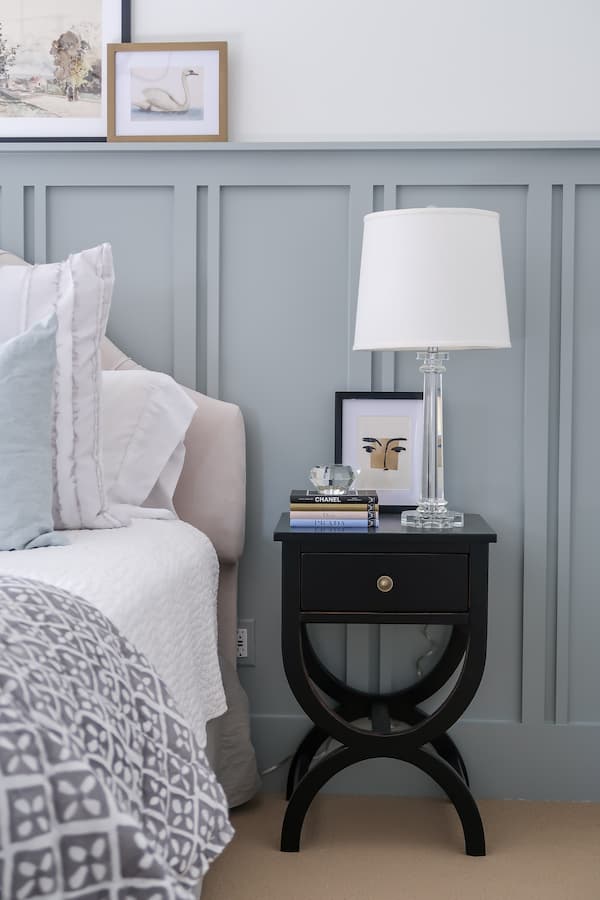
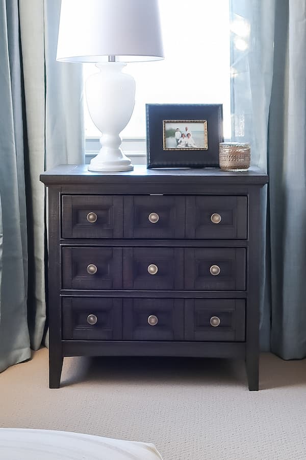
To trade up the look of the nightstands I updated the knobs to pretty antique gold for a more English cottage feel.
The gold knobs were so affordable coming in a pack of 10, which is exactly what I needed for the larger weathered black three drawer nightstand.
Believe it or not the lamps were both “attic finds”. Yes, I am a big believer of shopping in your own attic.
The crystal and milk glass lamps had that perfect Cottagecore feel!
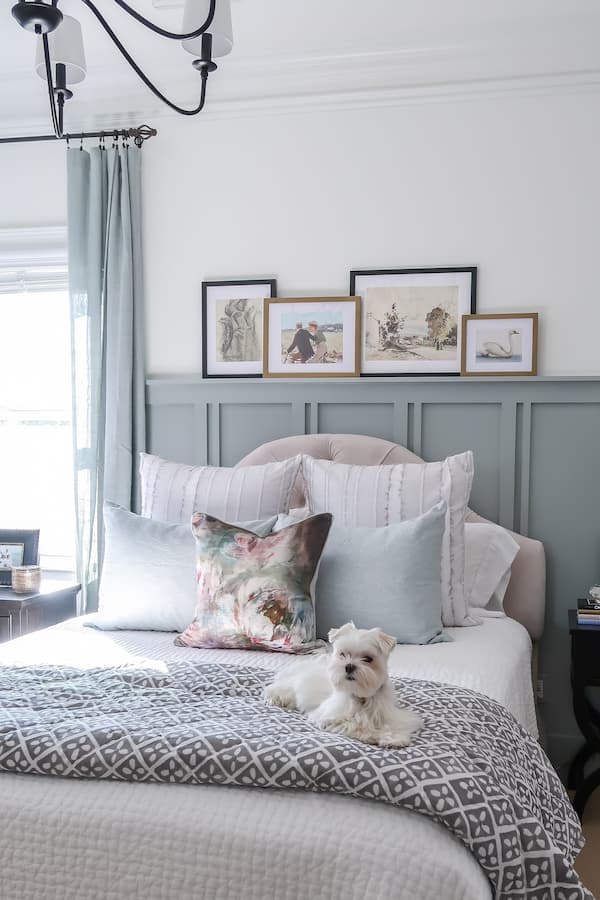
Mick even looks great in this room 🙂
You can see I saved a TON by reusing the existing headboard and pick stitch white quilt.
Why I like the quilt is you can machine wash and dry it after you have company. My mom says it’s the perfect weight, so why change a good thing?
Then I was able to find pillow cases in a beautiful blue green that matched the drapes!
Shop the Cottagecore Guest Bedroom

Do you love the Cottagecore aesthetic now that you’ve seen it in this bedroom.
I’ll teach how to get the same look and offer some other decorating advice:
The 4 Elements of Cottage Core Style
Inexpensive Tricks to Trade Up Your Home Decor
Here are a couple of paint color posts that may help if this isn’t the perfect shade for you:
Please consider following me on Pinterest and Instagram for daily inspiration.
Until next time!
Porch Daydreamer
Tracey
What sheen did you use for each color? The blue/green and the pure white?
Hi, Kisa! Thanks for asking because I missed adding that information. The Mineral Deposit board and batten is painted with semi-gloss and the Pure White Walls are eggshell. Hope that helps!
Beautiful design. I am trying to purchase the curtains but found 2 that look similar on the PB website. Is this Chambray or Mineral Blue?
Good question! Mineral Blue.
The room looks fantastic! I love your choice of colors. What is the paint color on your walls and ceiling (white)?
Hi! Sorry, I put that in the design plan for forgot to add it to the post. The ceiling is the original ceiling white from when I bought the house, walls are Pure White from Sherwin Williams.
Would love to see the map of how you did the board and baten!
Thanks for letting me know!
I wish you could reveal the name of the actual piece of furniture from Wayfair. When I try to check your products I end up with 24,000 items! At least when I try to find the exact product I have zero luck. But the guest room looks very fresh and inviting!
It’s called the Victoria Dresser and must be out of stock. I link the larger one in the pictures, so you can shop the collection and hopefully it will come back stock!
I would love a tutorial on laying out board and batten!
You got it! Thanks, I will work on that.
This looks just lovely as do all your makeovers. Can you tell me the style/type of carpeting you used in the “after”. I want that textured style in my own bedroom and get away from the plush I have now. I love the interesting texture. It has a coastal feel to it. Thank you.
Hi! It’s the same carpet I have had for almost 12 years 🙂 It is a low pile berber and is in a deep sand color. Since I chose it through the builder, I don’t have additional information. I highly recommend berbers because they are so durable!